![]() I’m not one to go nuts about green stuff, but this is pretty damn cool: Ecofont.
I’m not one to go nuts about green stuff, but this is pretty damn cool: Ecofont.
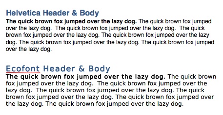
It’s a font that’s designed to use less ink, thus consuming less resources (assuming, of course, that you don’t go on a printing binge because of all the ink your saving…). As you can see from the Word screen shot below, there’s not a lot of difference between the two at standard text sizes. You have to blow up the text size about 300 percent to even notice the dots.
One annoying thing about the font is that while it’s called “Ecofont” on the web site, once you download and install it the actual font name is “spranq eco sans”. That threw me for a loop when I went to look for it in Word and expected to find it as “Ecofont”.
Hat tip to Courtney Bentley for learning about the font at her recent NERCOMP conference.