I spent the last week or so rolling out the 2017 editions of Lafayette’s i-World and i-Lingua badges. Evidence to support the various flavors of badges is collected using a customized Moodle instance (called, simply enough, “Badges”). Once graded using the corresponding rubrics, the badges are baked by Moodle and can then be shared with the world via Mozilla Backpack or a microcredential service like Credly.
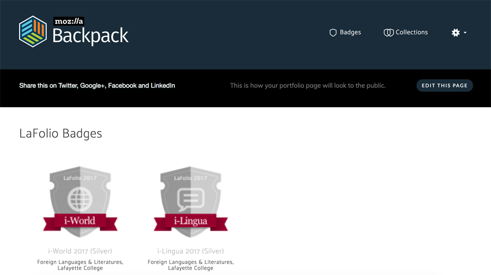
Mozilla Backpack was recently redesign and the end result is a slimmer and simplified website. Unfortunately for us, it also resulted in blurrier badges, as you can see in the example below:

The problem? Moodle exports its badges at 100×100 pixels, which was the informal standard for Mozilla Backpack (and thus for the badges framework in general). Mozilla is now displaying those images at a larger size, causing our badges to look blurry.
My co-worker Charles Fulton delved into this, and figured out why Moodle does this (or at least, how it does this). When you upload a PNG file to use as a badge, Moodle generates three versions of the badge
- A 100×100 scaled version (f1); this is the primary badge image
- A 35×35 scaled version (f2); for thumbnail icons
- A 512×512 scaled version (f3); unknown
That last one would be ideal for sharing out on the new-and-improved Mozilla Backpack, but Moodle doesn’t make that image available for use. There are two Moodle Tracker issues related to this problem:
There isn’t any motion on these issues but it’s something we want to look into further.