
My Lafayette (https://my.lafayette.edu) went responsive on October 15, 2014, which means it now works equally well on smartphones, tablets, and desktop computers. This should come as welcome news to anyone who ever growled/cursed/cried in frustration while pinch/zooming site in their phone’s web browser.
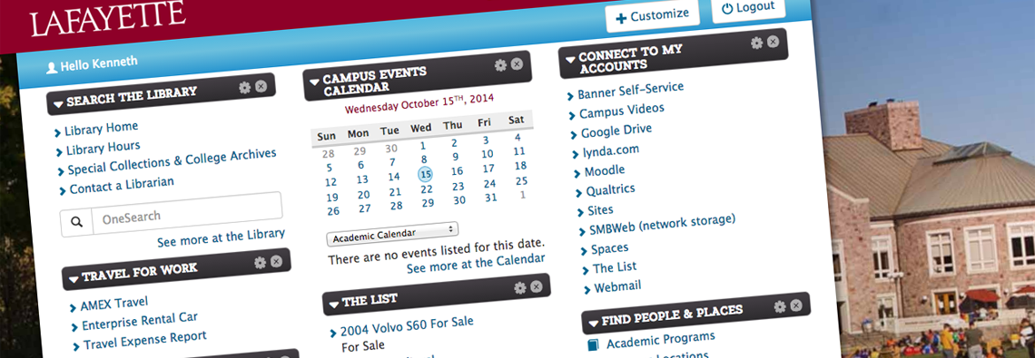
We also made a number of other smaller, but useful, improvements to the site based on feedback from the college community. The “Add a block” link was replaced with “Customize”. It works much the same as before — this is where you go to add blocks to your portal, but it also lets you remove blocks too.
You could always remove blocks by clicking on the “X” button in the title of any block, but with the change to “Customize” we felt it was important you be able to add and remove blocks in the same place. We made this change after feedback from portal users revealed that “add a block” was a confusing term — it wasn’t obvious exactly what it did. The data backed up the anecdotal evidence; we found that most people using the portal didn’t add or remove that many blocks.
The site isn’t perfectly mobile friendly — while you can add and remove blocks on your phone, you can’t reorder them — but it should be a significant improvement.
We also turned “Customize” and “Logout” into buttons rather than links; this makes them more obvious and easier to use on a mobile device. Finally the entire design is more streamlined — the header (which includes the logo and search bar) is tighter, and the bulky footer has been replaced by a more streamlined one.
Technical minded folks might like to know that the new theme is based on the Bootstrap framework while the site itself is powered by Drupal.