Miranda Wilcha & Peter Todaro
Thesis statement: Garden of Easton is a tool that will connect Easton’s consumers and growers by attractively mapping out food banks/pantries, community gardens, CSA pickups and locations, farmers’ markets, and other sites where people of all backgrounds can access fresh local produce. In so doing, this will bring together resources from all of the aforementioned organizations and parties within the community and close the information gap that exists between the dozens of organizations striving for food justice. We hope this will allow users to explore the food justice initiatives that exist in our area and integrate citizens of Easton into them.
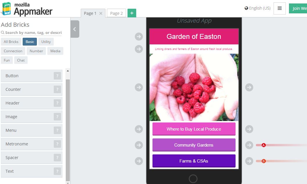
1) Mozilla Appmaker: This tool lets users create an app by placing “brick” upon “brick” so anyone can build a simple smartphone app without knowing code. Images can be uploaded, and different pages (linked from buttons that users can build in) appear for easy navigation throughout the app. Colors indicate different channels so users can connect blocks to others, making an interaction interface. The appmaker is rather intuitive, and we were able to draw up the first “page” of a trial-run Garden of Easton in minutes. The apps it creates are simple, sleek, and user-friendly. Rather than working from a map-to-information interface as we wanted to before, the appmaker might force us to rethink this design into an information list-to-map one. Once the product is finalized, a QR code is given so users may install the app (therefore physical posters with the code must be handed out and displayed throughout town and on social media). Does this mean that, once published, revisions cannot be made? If so, this could be a major hindrance to our resource.
2) StoryMap: In first looking through StoryMap, it was apparent how simple it is to create an attractive, interactive, well-curated map that includes embedded media and descriptions for each site along the journey. The beauty of StoryMap is that users may follow the designated path from one site to another, or are allowed to go “out of order” and choose at their leisure. The examples were widespread, as well. Some high-profile news sites had embedded StoryMaps to follow stories, but others were fictional like the Game of Thrones outline on a fantastical map backdrop. The issue that arose was that it’s nearly impossible to use on a mobile device – which is the focus of our project. Crestfallen at the prospect of loosing something that might work beautifully and interactively, we searched for how to amend the tool.
There are numerous StoryMap designs: playlists, countdowns, bullet layouts and more. What we thought might work best for our “drawers” of different maps to show would be the accordion style seen in the picture below.
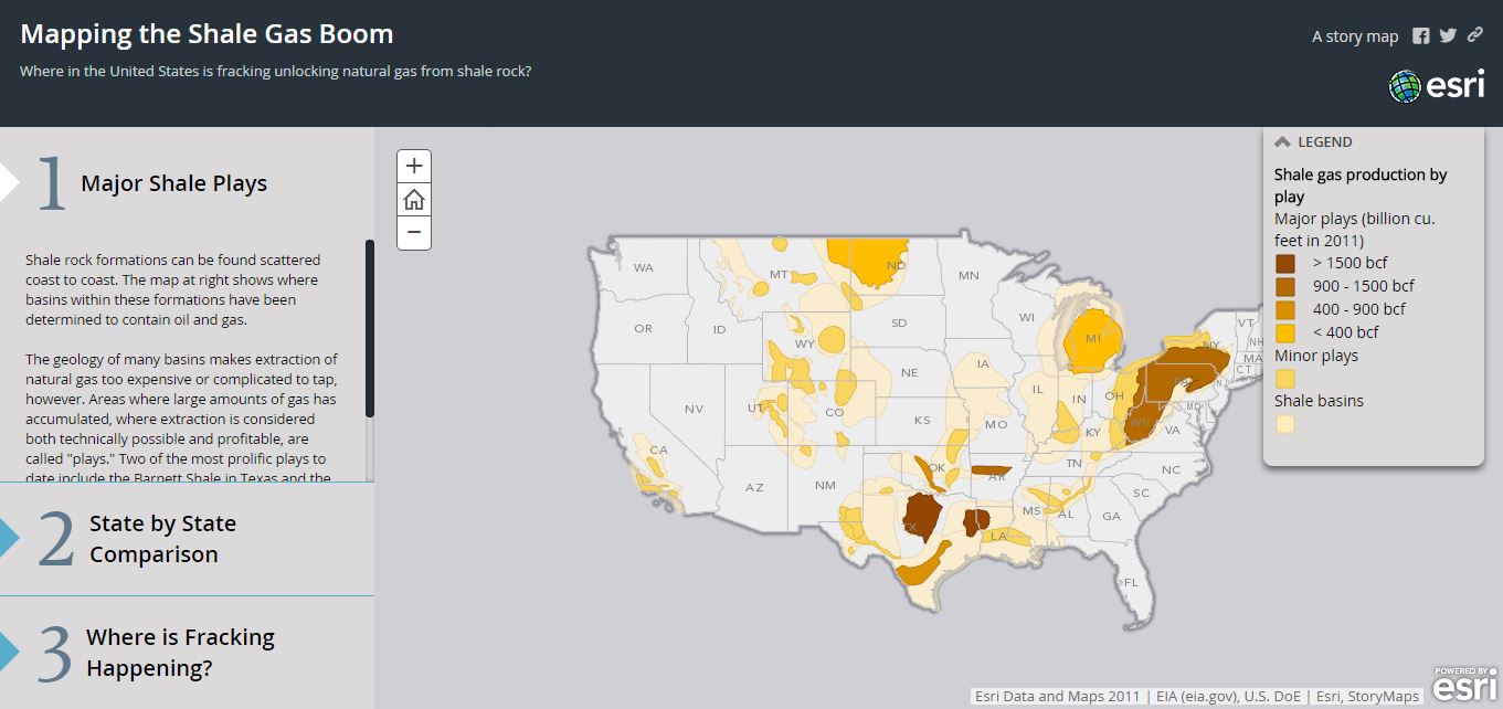
Courtesy of ArcGIS StoryMap example.
While this layout is much more conducive to the layers of maps (community gardens, then CSAs, then soup kitchens… etc.) and lets all categories be seen at once (while still having great interactive features that allow users to click the map data and read more!), it just wasn’t mobile-friendly. On a computer, the site is intuitive and sleek. On a phone it becomes difficult to load the StoryMap, pinch-to-zoom features make the map dysfunctional, and information is hidden until users learn how to expand it. Unfortunately, as perfect as this tool would have been… it just does not have mobile capabilities.
3) WordPress: Having a background in WordPress (many Lafayette College club websites are hosted through the tool), we knew this platform was always an excellent option. The format is mobile-friendly and has GREAT features. For example, the dashboard lets you edit the entire layout, design, and information presented on the site AND status as the holder of the domain lets you track views. WordPress is also extremely versatile while also allowing easy building blocks/widgets to customize your website without having to know how to code. Peter and I bought our domain name for the time being, Garden of Easton! The site also lets you embed other tools – for example, we could consider embedding a StoryMap.
Ian Morse
There are several relevant tools offered by Voyant, and dozens that may have tangential relevance to my project. Here are the ones that stood out to me:
TermsRadio “provides a scrolling line graph that can depict the change of the frequency of word across a corpus spread over time.”
– If the frequency of words or phrases can be any indication of the types of topics published about, this tool will be ver useful in assessing prevalent topics and their change over time.
Termometer “provides a more compact version of the tool TermsRadio. Unlike TermsRadio the temporal dimension of the tool is not expanded across the x-axis. Instead the change in frequency of the word is captured in through movement in the y-axis.”
– Very similar to TermsRadio, I can use this to experiment with other ways to more clearly show the temporal dimension of word choice.
RezoViz “visualizes the relationships between people, locations and organizations in a collection of documents.”
– It looks like a word map and can be used to show which other topics are discussed when certain topics are mentioned in an article.
Mandala “allows the importing of “textual” files to perform analysis on the frequency and linkage of terms. For example, importing a play would allow the user to find the linkage and frequency between a term and its speaker.”
– Almost a combination of the first three, this can also be used to show the relationship between the frequency of the topic discussed and the topic in the headline. For example, it should be able to show when media freedom is not mentioned in the headline but frequently appears in the article.
Document Type KWICs Grid “displays a table contextualizing a selected word with the phrases or paragraphs of text that directly precede and follow each instances of the word throughout the corpus.”
– This will be helpful to visualize the relationship between certain topics and topics that often arise in their context, to see, say, how often “government” arises when speaking about “media”.
Document Type Collocate Frequencies Grid “provides and ordered list of word collocation for a specified word and document.”
– Also similar to the KWiC Grid, it provides information on when words arise when a keyword does. This tool is configured in a way that is more readable and analyzable.
Timelines
I would like a significant part of my project to have a temporal component, because that is how I will be able to show a relationship between variables. A spatial component could also help in this regard, but there is little to show spatially between two countries. Thus, a timeline is the most effective way to visualize the relationship between the variables I’d like to study. What I would really like in a timeline is a way to show trends, i.e. graphs parallel to events, and I have not found that yet.
Viewshare is the closest thing to my vision that I have found. It allows graphs to be created alongside a timeline (although the layout makes it difficult to see direct connections in time). I’m unsure if the tool will allow me to create graphs that use different data than that which is presented in the timeline adjacent to it. For example, I wish to present the data from indices while I can also view on the timeline the events which may affect those indices.
TimeRime “is a web-based tool allowing people to create, view, and compare interactive timelines.”
– It seems you can add layers of events and create longer periods of time, in addition ot individual events with this tool.
TikiToki is an excellent tool aesthetically. It allows you to categorize events in the form of layers and colors and embed all kinds of media.
TimeMapper predictably does what its name suggests, maps and timelines can come from your google drive spreadsheet. Not easily customizable.
Timeflow seems like a more customizable desktop application that can deal with more data points, but less information for each.
TimeGlider allows you to zoom in and out of a timeline to see morse data points with more precision.
Aeon Timeline “is more like an abstract temporal entity management program. It happens to use a visual timeline, but it allows for conceptual linking of people, places, events in a rather clever fashion. It is intended for brainstorming and collecting via flexible input and export. With Aeon, you can divide your timeline into logical groups, projects, or concurrent arcs. You can model the relationships between events and people, places and ideas. Aeon calculates people’s ages for you. And you can link your events with research material such as external files or images that can be displayed inside the application.”
– I’m not sure what “concurrent arcs” mean but it seems like it could mean trend lines. This seems the most customizable and user-friendly. Unsure if embedding to a website is an option.
TimelineJS “is an open-source tool that enables anyone to build visually, rich, interactive timelines. Beginners can create a timeline using nothing more than a Google spreadsheet. Experts can use their JSON skills to create custom installations, while keeping TimelineJS’s core look and functionality.”
– Doesn’t seem very customizable, and only individual events can be viewed. It’s difficult to see trends.
AHMED BRAXTON
Thesis Statement:
1. If the process of gentrification continues to happen in the District of Columbia, specifically the Barry Farms neighborhood, then there will be an even greater displacement of peoples (the peoples for whom the establishment was initially built.
2. If the city of Washington DC continues to gentrify, especially gentrify the Barry Farms then it will lose the historic aptitude of Native citizens and in doing so the communal knowledge of the heritage and culture of the District.
3.Gentrification will not only have a detrimental impact on the citizens of Barry Farms, but also will be deleterious to the entire city of Washington DC. Turning what should be deemed as a ahistoric landmark into a complex of overpriced condominiums, definitively showcasing the socially deemed worth of black people in America. By stopping the current gentrification process, restoration of the Barry Farms community would be able to take place with demolition. Rather than tearing down, a complex of historic value the neighborhood should be re-established as a historic landmark or due to the land’s significance of being a land purchased for freed people post-slavery, should maintain its significance and should be left aside in terms of pursuit of gentrification purposes.
POSSIBLE TOOLS
What Was There: This tool is essential and the fundamental basis of my project. Through using this tool, id be able to give several visuals of what DC (both culturally and physically) looked like prior to the initiation of gentrification and how it looks currently, and possibly projected afterwards. Using this essentially summarizes all of the work and research which I have put into the project in respect to both gentrification in DC and all over.
KnightLab: The usage of a timeline when discussing gentrification is essential. 1. It gives off the vibe I would like it to give off which is that the effects of massive gentrification are very criminal. 2. It allows me to showcase the typical flow of gentrification circa one neighborhood. 3. It is a very easy to use tool in terms of visuals.
Viewshare: An excellent tool for mapping and a variety of other things. The first thing that came to my mind while viewing it was that I could map various Washington neighborhoods and add pop-up tags to them. These pop-up tags could be (once I am actually able to use them) narratives of various displaced peoples from different neighborhoods throughout Washington DC.
Feevan Megersa
CartoDB
This user friendly site serves as a map editing platform where one can not only map a specific location but can add layers, information, and filter datasets. The website has an easy to navigate interface and allows for the user to export the maps created onto other digital spaces.
HUBzero
This is website is geared towards people that plan on incorporating different types of data( such as pictures, graphs, information tabs etc.). It is highly customizable, enabling one to design their own web template, upload all their data, manipulate the data to make it more accessible to the audience( by simulating it or visualizing it), analyze the data, publish it, and receive feedback from users or collaborators via reviews. The ability to design your own web template allows the user the flexility to include as much components and data to the website as they want, guaranteeing that no two websites are identical. However it can seem quite daunting to have to manually design an organizational structure for your website from scratch. Luckily if someone needs help setting up their website they can turn to a range of hosting services to do the work for them.
Lynks
This is a great organizational tool that allows the user to present multi-layered data or information in a non-linear and visually stimulating manner. It is quite ideal for people working in groups on a project. Not only does the user get to see the data that each group member has been working on individually but also its connection to the other components of the project. A potential drawback to the site is that the more information that one includes the more cluttered the space becomes making the site appear quite overwhelming with information for newer users.
One thought on “Tool Reviews”