Blog on media freedom: thatcriticalspace.wordpress.com
Thesis Statement
The Turkish government’s relationship with the country’s press is negatively affecting the quality of its journalism. The country should focus on factors such as press market strength, legal restrictions, and self-regulation to create an environment like Finland’s that is more friendly to the free, untainted flow of information.
Introduction and Abstract – A comparison between Turkey and Finland
Many measures of press freedom developed by advocacy groups, such as Reporters Without Borders and Freedom House, are simple aggregations of point scores derived from extensive questionnaires. The values that are shown on these indices are thus the results of several calculations of very different indicators of press freedom. This is to ensure that press freedom scores can be compared across countries and time periods.
However, the image created skews its interpretation. It portrays countries with similar scores as suffering from the same problems. For example, as the RWB recognizes itself, “Africa’s newest country [South Sudan] is torn by civil war and has an extremely polarized press. In Afghanistan, it is the state’s ability to guarantee media safety that is lacking.” Despite differing causes of low press freedom measures, South Sudan and Afghanistan have almost identical scores: 38.04 and 37.44, respectively. When searching for solutions, it does not help, and is in fact counterproductive, to believe that all countries suffer from the same problems.
Several pundits and non-profit advocacy groups have however no problem in pontificating why the best countries on the index occupy the position at the top. Finland has been a hot topic in press freedom circles because of the 13 years that the RWB has produced their index, the Scandinavian country has come out on top 11 of those years. In the debate to understand why, these reasons pop up:
1. The Finnish press enjoys a strong and healthy market fueled by high readership, because Finns seem to read a lot of newspapers, especially in print. According to some definitions of journalistic freedom, the press needs to be free of economic constraints in addition to political independence. A healthy market means publications have less incentive to adjust normal practices to gain readership and revenue.
2. There is a a high degree of self-regulation by the media through the Council for Mass Media, which creates and maintains journalistic ethics and standards. The Union for Journalists also has large membership. Finnish journalists act as each other’s system of enforcement for high journalistic standards.
3. The Finnish government encourages legislation that increases access to information; there is a culture of open access.
4. The Finnish government is one of the least corrupt and most transparent governments in the world. Government suppression or restriction of the media is thus unnecessary, although this does not account for non-government entities that seek to censor unfavorable publications.
At the same time, the proponents of these arguments must also recognize that Finland simultaneously exhibits some traits of a country with a low press freedom score: the government actively enforces laws that aim to protect religion and ethnicity from defamation. The media in Finland is also largely own by only three companies, which one would believe decreases the level of independence of individual news media.
How does the level of press freedom relate to the journalistic environment?
The RWB published along with their index a study that analyzed the relationship between their values and five other measures (per capita GDP, HDI, political stability, oil-derived government revenue, and percent of GDP devoted to the military). They found a positive correlation coefficient between each, but they leave out any indication of a rigorous method, other questions they could have asked, or the full extent of the data they used. If the goal is to seek solutions to press freedom violations, there is a second problem. The variables chosen are not the most useful: they are only indirectly related to the press body itself, and they are derived from much larger-scale factors and thus affect and are affected by countless other variables. This results in a blurry image of whether these measures come from a lack of freedom or lead to low freedom scores.
The above question narrows the scope to forces which directly affect the press, not at the country level, but at the institution-, organization-, or even individual-level. The question is one I hope to answer with my project and the one that current indices and projects do not attempt.
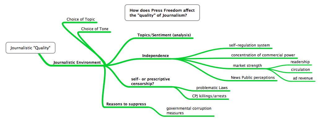
“Journalistic environment” is a term made more specific from a term I initially chose: “quality.” It’s difficult to pinpoint what exactly quality entails, and its much harder to measure. Quality is however influenced by the environment from which it comes, and that environment is composed of more variables that are easily quantified. I’ve itemized the definition into four components, all of which influence the choice of topics and tone in publishing content:
1. Topics/sentiment – What a newspaper chooses to publish and which tone they choose to use are indicative of a newspaper’s mentality. Running topic, sentiment, word clouds, and key word in context (KWiC) analyses on specific newspapers surrounding specific can pinpoint changes in a newspaper’s approach to publicizing. The results from this component analysis of the state of the journalistic environment will be the crux of the study because it can provide the clearest examples of change relative to other factors.
2. The level of independence directly affects the kinds of topics and tones chosen to portray a story, and independence is directly linked to a few quantifiable factors. These are the measures I will use to represent independence: the presence of a council or organization of journalists whose job it is to self-regulate general news media; market strength as defined by factors such as readership and advertising revenue; the concentration of the control of the media in a certain number of corporations; and the level of respect the news media holds in the public’s eye, which can be derived from Pew Research surveys on the public perception of the news in each country.
3. Self-censorship or prescriptive censorship is the most unquantifiable component of a journalistic environment, but it can also be the most destructive of a system. What can be quantifiable, however, are the things that induce fear of publishing content and cause this kind of censorship. I will thus consider things like legislation against defamation of religions, ethnicities, people, or the like and number of arrests, threats of violence, and deaths in a country.
4. The reasons that media would be and is suppressed should also be considered. These are most often corruption in the government. There are however many places where press suppression does not come from the government but by non-state actors who have similar levels of power. In these cases, the ways they execute power are through intimidation, often physically, and that can be counted in the above component. Generally, measures of corruption will cover all those in power who may want to suppress media.
These measures are largely included in many press freedom measures, but as mentioned above, the values are not broken down into their constituent components. I have not been able to get access to the RWB index broken down into separate components, but the Freedom House press freedom index, while not as specific in its aggregated form, does provide some breakdowns on its website.
These press freedom indices however do not include analyses of the content of the press itself. That is how this project will benefit the global discussion on press freedom: it includes a text/content/sentiment analysis of newspapers to reveal change. This helps answer more directly the question of how press freedom affects the “quality” of journalism itself. It puts a more tangible and visible face to the effects of press freedom.
The Turkey Connection
Turkey suffers from an extremely low press freedom score, brought down but frequent government crackdowns on newspapers, television stations, cartoonists, and individual social media users. The press is very familiar with the processes the government uses to suppress them, and the adjustments they make to their publications as a result are unmistakable. The changes that have wrought the individual articles have not as of yet been documented. I am very familiar with English-language newspapers in circulation in Turkey, as well as hot topics in the last 10-15 years. The factors that press freedom advocates believe are responsible for high press freedom scores in Finland are easily found for the Turkish case.
I thus aim to shape my project as a comparison between the most press-friendly country in the world, and one that desperately needs to reform its relationship with its press. I envision an analysis that considers the four factors that constitute a journalistic environment, depicted along two timelines for each country. The latter three factors, including press freedom measures, can be plotted along the timeline. These may be legal changes, global trends, and elections. A few points along each timeline would indicate where I will have done text analyses of English-language newspapers surrounding certain nationally impactful events. The analyses would cover content covered before and after the events that were meaningful to press freedom. Viewing both sids in light of the changes will shed light on to how the press itself changes.
Annotated Bibliography
Reporter’s without Borders’ Press Freedom Index 2002-2015: http://index.rsf.org/#!/
The link above only provides a visualization and data for the period 2013-2015. The data for the period 2002-2014 is in an excel document on my computer found from this site hosted by the World Bank: https://agidata.org/site/SourceProfile.aspx?id=4.
This index attempts to quantify and compare levels of press freedom in all countries in the world by observing only the level of freedom, not quality of media in each country. It’s methodology can be found here: http://fr.rsf.org/IMG/pdf/methodology-en.pdf. The data is derived from a questionnaire of 87 questions in 20 language sent to people in each country who are familiar with the domestic journalistic atmosphere. The list of questions (http://rsf.org/index/qEN.html) and by extension the categories considered in the index include: the legal status of the media as an organization and the legal status of journalists; pluralism and editorial independence; limitations in the law; and the internet and technical resources. More generally: Pluralism, Media independence, Environment and self-censorship, Legislative framework, Transparency, Infrastructure, and Abuses. The map combines these score through an equation to label by color those countries in a serious situation and in a good situation. However, I have not found the raw data that shows where countries fell short in certain measures. For example, the RWB declares that it is Afghanistan’s inability to protect journalists and South Sudan’s highly polarized press that brings down each countries’ score. But these happen for very different reasons, so solutions should be approached accordingly. Solutions are hard to find and be effective if outside observers believe the cause of low press freedom is the same everywhere.
RWB also included a very short study into the correlations between their index and economic and political measures: http://index.rsf.org/#!/insights/perspectives-other-indicators. They find a correlation between their index and per capita GDP, HDI, political stability, oil-exporting countries, and the proportion of GDP spent on arms. The parts that are left out of this analysis are correlations between the reason for a low score (as discussed above) and a textual analysis that might show the types of topics that are spoken about in each country. This also is not mapped and provides no visualizations.
http://amecorg.com/wp-content/uploads/2011/10/Media-Content-Analysis-Paper.pdf
If I am to carry out a text or content analysis, this document will will very helpful for methodology. It speak solely and specifically about the methodologies of analyzing text using computer code. Most valuably, it provides a comprehensive flowchart to lay out exactly which steps should be covered when going about a text analysis. http://www.stateofthemedia.org/2009/ethnic-intro/content-analysis/ as will this.
FINLAND
http://pressfreedomnow.org/finland-press-freedom/
After a bit of reading around the topic of press freedom measures from the year 2015, I found immediately that Finland was a hot topic. It topped the Reporters Without Borders Press Freedom Index for this year and last and several sources, like this one, attempted to explain why. The article, hosted by anonymous writers with self-proclaimed experience in journalistic fields, listed 7 things: 2 reasons why one may not expect Finland to be so press-friendly, and 5 reasons to explain why it is, both of which I can treat as hypotheses in my project. Most of Finland’s news media are centralized into just three media corporations, and the Finnish government actively pursues and imprisons individuals whom they find have defamed religion or ethnicity. The five reasons that Finland facilitated high press freedom measures: A healthy press market fueled by high newspaper readership; an independent self-regulation system of the news media by a mass organization; a strong union of journalists to create and maintain standards and ethics; legislation that encourages more and more access to the information; and high levels of transparency and low levels of corruption. The healthy market and powerful self-regulation means that the centralization of the media in three companies may not influence the quality of freedom.
I can use Finland as kind of control group to test and challenge these ideas to see why press freedom is higher in retain countries and lower in others. The article used this source funded by the Finnish government on Finnish media: http://finland.fi/Public/default.aspx?contentid=162833&nodeid=41808&culture=en-US. Perhaps as a database for defamation laws, there is this site: http://kellywarnerlaw.com/finland-defamation-laws/.
Uimonen, Risto. “Finland of the Free: Why the Finns Always Top Media Freedom Indexes.” Index on Censorship 44, no. 1 (2015): 107-11. Accessed June 10, 2015.
Again people in the field are talking about Finland. The author of this piece is the chair for the country’s mass media council and argues that the presence of a influential journalist council (his own) that maintains journalistic standards and ethics makes it possible for the country to allow for a very free press. The key, he says, is self-regulation. For example, editors must publish a new article if facts are found to be factually incorrect in previous ones, because the other members of the council “keep an eye on each other.” This theory can be used as a base hypothesis to be tested: how does the presence or number or cohesion of press organizations correlate with press freedom measures? His article implies that press freedom is directly correlated with, and maybe even caused by, the quality of journalism, or adherence to journalistic standards and ethics.
Databases
http://belfercenter.ksg.harvard.edu/files/wpf36governance.pdf
The link above directs to an article assessing 50 different databases on such things as economic and political indicators. The article was published in 2003, and the data in some of the sets thus may only go to the late 1990s. I would have to see if the ones that are relevant to me have been updated since then. In addition to the timeframe, I should also be wary that most measures only cover certain countries, whether by region or other factors. Key is the difference the author describes between objective and subjective measures: the former are usually already quantified, the latter must be quantified from qualitative data such as observations and may thus be skewed. My project will mostly rely on subjective data, but interesting results could come from correlations found with objective data.
https://agidata.org/site/Map.aspx
This link leads to a interactive map hosted by the AGI Data Portal created by the World Bank and populated by the Global Integrity Index’s data. The map seems to only provide data for they ears 2006-2011, although the drop-down menu implies the period 1990-2015 is covered. Another drop down menu provides an excellent breakdown of dozens of possible measures that answer the questions “Are media and free speech protected?” “Do citizens have a legal right of access to information?” and “How accountable is the executive branch?” The data is unfortunately limited in its scope; not all countries have data and the countries for which there are data do not have data in all categories. The value of this project can be the questions it asks when determining the factors to measure, and the data is easily exportable.
http://www.stateofthemedia.org/2011/mobile-survey/international-newspaper-economics/
This is the Pew Research Center’s annual report on the state of the media for 2011. Key data included: newspaper advertising revenue change (can be indicative of a movement towards a less healthy press market). The information for international publications and circulation is a little harder to find but it seems like it is there. They use data from the World Association of Newspapers and News Publishers World Press Trends reports: http://www.wan-ifra.org/reports/2014/10/07/world-press-trends-report-2014. This report implies it has data for circulation and revenue, although a big disadvantage would be if it is aggregated into continents, which is possible given how the data is presented in the State of the News Media. There is also a subscription to the dataset which provides a little more flexibility with the data: http://www.wptdatabase.org. This provides data back to 2010.
Other Projects
http://mediafreedom.ushahidi.com
The Mapping Media Freedom Project owes most of its value to the main sources of its data. Anybody can log a media freedom violation. The only pieces of information that are required are title, a description, your age, location, and a categorization of the incident. There are individuals verifying the information by using other sources, although the nature of limiting information is that there may be no other way to verify each incident. Nor is it immediately clear which secondary sources are considered worthy of being able to verify.
I would be curious how many incidents are reported but are not added to the database because there exists no secondary confirmation. I’m also unsure which kind of people this platform reaches and if it leaves out a key demographic that may simply not have access to such technology, perhaps because they don’t rely on or are not as savvy with the internet.
The method of collecting may also overcome a key problem in aggregating such events. Global organizations such as the CPJ and RWB have correspondents in countries, but they largely observe from above. They are detached from the ground, and in their decision to publicize or latch on to specific events, they may deem them less important than they are. This platform doesn’t let lack of empathy get in the way: those who are affected and may feel most passionately can determine whether its reported. The filter with the secondary level then determines if it is true or appropriate for the database.
The map is the most crucial part of the platform. Zooming in makes each event more precise. From the first look, events only seem to be categorized by country, but as you zoom in, you can see that specific locations even within cities have seen more violations. Unfortunately, the nature of mapping and requiring a location forces incidents like online censorship and harassment, which may not have a specific location, to choose a location that might skew our view. It may also give the impression that more violations can be identified physically than are possible.
Also important is the time component of the map. It’s only in its first year, so the time dimension may not reveal as much as it will definitely be able to in the future. Space and time are however the two most significant aspects that need to be recognized when creating a database, and they combine them excellently in one tool. However, the way the time is set up is a little confusing and it shows some unlikely results sometimes. For example, the number of incidences increases at some points when you narrow the time frame – usually shaving off a month of a period would decrease the number of incidences. There might be a glitch there.
The map can also be divided into separate categories of violations, so the cases which may not be fully “violations” (like when a TV crew is “verbally harassed”) can be separated from the extremely threatening cases, such as arrests and deaths.
Each report can be viewed individually, with all secondary verifying sources and descriptions. A separate section gathers the news on media freedom violations, which dives a bit deeper, provides some analysis, and gives the position of other media freedom organizations. It’s altogether a brilliant idea.
In terms of possible improvements or expansions, Peter pointed out that this map could be combined, possibly by adding a layer on top of the existing one, with a dataset that included news-reported events, rather than self-reported events.
https://www.detective.io/detective/the-migrants-files/
The Migrant Files is an international collaborative effort to track the dangers of migration. It does this by focusing primarily on migrants coming from Africa and the Middle East towards Europe, beginning on January 1, 2000. Other organizations have also sought to record deaths and disappearances of emigrants to Europe, but The Migrant Files aims to create a comprehensive and reliable database of these events.
The project derives their data from these organizations’ reports and is the first to map the records. While they do say each incident is fact-checked, each incident still depends on whether it is reported in the media, government publications, or unpublished academic literature. To deal with large amount of data, The Migrant Files uses OpenRefine, Detective.io, and a methodology called open-source. There is also no definition of what constitutes an emigrant death – whether the incident has to happen in transport, whether they are illegally doing it, or by what means the migration was attempted.
Every incident is organized by its latitude and longitude, date, number of deaths or disappearances, and cause. Individual emigrant deaths are also recorded and organized according to name, gender, age, and nationality. It’s however unclear how they obtain that information, and many events do not give names of individuals. They are not able to provide much information on the many bodies that simply wash up on beaches.
The map they provide needs a little work. When you click on an incident (varying by side to coincide with the number of deaths in at any one place), all that is revealed is the number of deaths that occurred between 2000 and 2014. It takes a quite a bit of effort to find more information for any one point. Also, there are large points in the center of cities or countries. This skews the accuracy of visualizing the incidents, because when a boat capsizes between two countries and an exact location cannot be identified, the incident is place din the center of the place of origin.
They’ve created another map that shows the network of incidents, connecting origins and destinations: https://www.detective.io/detective/the-migrants-files/event/54845/network/. This map allows the user to click on an event and get more information, but it still requires a bit of effort and deviation front he main network page. This may sacrifice to much user-friendliness for style, as it is also slow to load and respond.
We must also be careful how we draw conclusions form this map. They only record deaths and disappearance, so we cannot assume any relation to the number of successful migrations, when all migrants live. It would be both helpful and interesting to consider why successful operations worked, especially considering they began the project to help inform policy decisions. In that regard, it needs a substantial amount of extra work.
The “Mapping Texts” project takes over 232,000 pages of newspaper text from newspapers throughout Texas since 1829, analyzes them linguistically, and plots them on a map. The Linguistic analysis identifies popular words across the period while the map can show the viewer where they were popular. It seems so far that they have only identified popular words, but not phrases or ideas (which are slightly harder to pick out with a computer program), which makes words like “united” popular while it may only be so because it comes up with “United States” often. The frequency of words is shown in both a bar graph and a word cloud, where the higher the frequency of the word, the bigger it is.
A problem with representing the frequency of words this way is that it does not adjust for the number of newspapers added over the 180-year period. It’s almost certain that publications came and went dying this period, so simply the nominal number of times the words has shown up does not tell us anything if it is not adjusted for how many times the same story would be printed. It’s also unclear why certain papers were chosen and some weren’t; they were previously digitized by another organization for another means, and it seems some are missing in the “Modern Texas” time period.
One of the maps depicts the number of publications coming from each city by correlating them with the size of the circle marking the city. It’s a bit unnecessary as the circles get pretty large and distract from what the visualization is supposed to show. In addition, the circle when clicked only gives the number of newspapers and the city, nothing about which or any statistics related to those newspapers, nor does it use the data from the linguistic analysis found on the same page. They seem completely separate, and the map seems unnecessary.
On another map, the newspapers are categorized by the ratio of “good” to “bad” words published, which defines the “quality” of the newspaper. This only means how well the OCR detected real words when they were digitized (every word like hpw$ counts as a “bad” word). Below the same map is a timeline of important events in the history of Texas. The graphs of each paper and the words each uses is however detached from the timeline, so it makes direct comparison almost useless. The map, like the first one, also seems useless/unnecessary because the data it geolocates (accuracy of the scans) does not have a direct connection to the location it is found.
If I am to do a textual analysis, this type of study will be useful to consider as an example, because it totals the appearance of major words and compares them across time.