Color and Belonging in Persepolis

After our class screening of Persepolis last night I was still a little perplexed as to what the use of color in the film really might have been meant to convey, other than differentiating between past and present. So, after looking online for a bit, and reading a few articles about the movie I was able to glean enough information to form a theory as to what else this use of color was attempting to convey.

Throughout the movie Marjane is seen to frequently be in conflict with herself, her surroundings, and most noticeably, the people around her. Much of this stems from her disruptive and war torn childhood, which had forced her to move away from her family at the age of thirteen, sparking a long lasting sense of loneliness, guilt, and confusion within her. Even when finally returning to home Marjane was unable to completely adapt back into her old society as she still could not identify fully with her peers, as her time in Vienna was drastically different from what they had experienced back home. While the film progresses onward, these emotions continue and it seems as though Marjane’s life does not really appear to improve. When Marjane finally comes to terms with the fact that she is unhappy with her life in Tehran, her parents  tell her she must move out of Iran and find a place where she is actually free to express herself, and thus live her how she sees fit. Although this ends the film at a somber note and it is clear Marjane is sad to leave her family behind, maybe this implies that Marjane is finally leaving her difficult past behind her and has come to terms with who she is and what she really wants out of life.

Therefore, by the director using color during the present, and black and white during the past, he is able to more effectively convey Marjane’s emotional maturity, and that her life may finally change for the better.
 

Grand Budepest Hotel

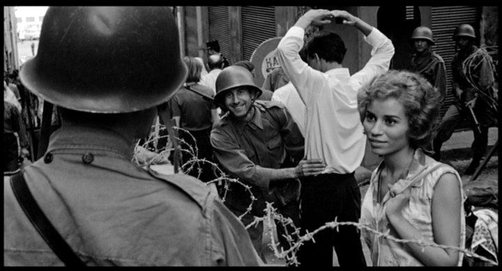
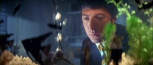
After watching the Grand Budapest hotel over break, I was amazed about how they were able to create such an amazing look to the movie from the sets to the color. After looking up videos of behind the scenes of the movie, I was able to find a youtube video that shows some of the shots in the movie with and without the effects. While watching I noticed that besides for the great amount of color correcting in each scene, there are also many miniature and CGI- created structures. In the movie, they also used a lot of matte effects and green screen technology. A lot of the movie used green screens in order to fit the characters on a miniature and in front of CGI animated structures. I also though it was interesting that they added stop-motion in the sledding scene which gave the scene a special look.

Cigarettes in Persepolis

 I noticed in Persepolis (2007) directed by Marjane Satrapi and Vincent Paronnaud, that cigarettes were used to signal the beginning of a flashback. The inital flashback started right after Marjane light a cigarette in the airport, the man that was in prison (I believe it was her uncle or father’s friend) light a cigarette right before he told his story, when Marjane resumed her flashback, and at the end of the film a man is smoking a cigarette as the film flashes forward to present time as Marjane leaves the airport in a taxi. I liked this subtle signal because to me it adds a sense of pain into whats about to be told. It is as if the characters are saying that they need to smoke to be able to open up and tell their tale. It does also provide a cool tansitional effect as the smoke whispers curl and fade as the shot fades to the flashback.

“New Director/ New Films” film festival

I came across this article today in the New York Times, and I thought it was very interesting. It discusses  a couple of notable titles from this weeks “New Director/ New Film” festival at the Museum of Modern Art..

http://www.nytimes.com/2015/03/24/movies/new-directors-new-films-festival-highlights-bold-narrative-experiments.html?ref=movies&_r=0

The Freedom of Animation

After watching tonight’s film I had an interesting realization about the affordances of animation. Usually a director will have a solid amount of freedom and control to shape the movie and push it in whatever direction they want. The director can dress the characters,  have some say in what characters are chosen, they can choose the set and all of the things that go in it. Within the accommodations of our world the director can really do whatever they want. However I find it interesting that with animation the director can create a whole new world. They can take the image from their head and really create it in the film. I really saw this in the film we watched tonight, especially in the way some of the scenes were set up, for instance when her father was telling the story of how the Shah came into power and the world took a puppeteer and comical turn. I also liked the point that was made in the after-film discussion about how sometimes when the film is set in a dangerous or hard to film place, such as Iran was during the time this film was made, animation can be used as a substitute. I really got a first hand experience of the affordances of animation tonight.

Animation continuing Child-like Helplessness

We often associate animation with child content, which is why this very serious topic seemed to clash with the presentation style – until further examined. A lot of the themes covered in the film like war, isolation, being uprooted from your home country and being put somewhere where you don’t belong can make individuals feel as if they are helpless, almost like children. Portraying this story through animation helped convey this sense of helplessness, where the world doesn’t even abide by the laws of physics and literally anything can happen.

Blurred Lines of War

I felt that the black and white coloring also represented how difficult it was to tell two sides apart during war time. Mr. Satrapi mentioned how people had begun to forget what they were fighting for as they ended the war. If you aren’t even sure what side you are on, how can you tell you enemies from your allies? The black and white painted all people with the same coloring; they are all fundamentally humans. With black and white coloring, even racial lines are invisible. The only differences are the clothing, which is an artificial layer over their being. Ultimately, I felt a them in Persepolis was that all people are people and the lines we draw to separate ourselves aren’t visible.

Continutous shots Birdman

Over spring break I saw Birdman (2014) which was directed by Alejandro González Iñárritu. I found the method in which Alejandro shot the movie was very interesting and unique. Each shot was very long and the cuts between shots were hard to recognize. This gave the film the feeling as if it was just one continuous shot. The camera also seemed to be mainly hand-held as it moved with the characters. It is an interesting filming method and definitely made the film feel less film-like and more realistic in a sense.

Importance of movement in a shot

Recently I came across this video essay which depicts the importance of movement in a shot. The video talks about how movement tells a different story ,in itself or exaggerates the emotion in the film.It shows the power of movement be it the camera, the character, the nature elements(wind,fire,steam) or all of them.Its fascinating to see how use of many people in the frame and all of them giving the same movement, or expression,  magnifies a particular emotion.The video emphasizes the importance of cinematography and puts forward a satirical message that ‘a film without cinematography is the same as turning light on and playing a radio’.The video also states how movement depicts a story in itself that the movie no longer needs a lot of dialogues. I really enjoyed the  video.https://www.youtube.com/watch?v=doaQC-S8de8

Keys in the Fish Tank

graduate-01

After The Graduate, we talked a lot about how water was used throughout the film to symbolize both Ben’s escape from reality, but also his feeling of being pressured in his life because he is “just drifting.” We payed a lot of attention to the scene where he is standing at the bottom of the pool in his scuba gear, but I don’t think that we brought up how this scene–and the major themes of the film–was actually foreshadowed at the beginning of the film during Ben’s first major interaction with Mrs. Robinson.

When Mrs. Robinson asks Ben to drive her home, at one point he nervously throws her the keys, only to have her toss them back at him. She misses by a long shot (obviously on purpose to flirt with him), but in doing so, ends up throwing the keys in the fish tank. This simple act is symbolic of how Mrs. Robinson interrupts Ben’s “drifting”  and adds a purpose/direction to his life (an inappropriate direction, of course, but at least she gets him to actually do something). But what is really cool, is, if you look carefully, you’ll notice that the keys knock over a statue of a frog in the fish tank (it’s hard to tell, but it seems like it is wearing scuba gear of some sort), that bears a striking resemblance to the pose that Ben makes while he is standing at the bottom of the pool. The film uses a whole bunch of these little nuances through muse-en-scene, but I thought that this one was especially worth noting. Even from the beginning, the film was telling us where it was going.