INDIVIDUAL MODULE PRICING TRENDS
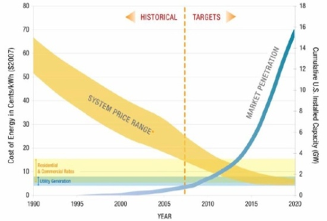
The energy cost vs. time period graph shown here graphically represents historical prices and projected performances of solar PV. This graph was obtained from the U.S. Department of Energy’s “Multi Year Program Plan 2008-2012” and shows the ‘Levelized cost of energy’ (LCOE) on the y-axis According to the figure, solar PV will obtain grid parity approximately around 2015-2016. Once grid parity is achieved, market penetration is projected to shoot up dramatically as shown with a projected fourfold increase in the cumulative U.S. Installed Capacity. [1]
Silicon is one of the most important raw materials required in construction of the solar PV modules and hence it is important for solar energy analysts to examine trends in the silicon market . The figure below shows the price of the different PV module technologies over time. This graph suggests that the maximum decrease in costs have been obtained for the carbon-Silicon PV modules compared to the other technologies. An approximately 67% decrease is seen for the c-Si modules from the first quarter of 2009 to the third quarter of 2012. One of the major drivers behind this tremendous reduction in silicon prices is the supply/demand imbalance in the silicon market. Essentially, due to a silicon shortage in 2008, the price of silicon skyrocketed attracting a large number of existing manufacturers as well as new companies to enter the silicon production and distribution business. These massive new plants and expansions caused a supply/demand imbalance pushing silicon prices to record-low levels. [2]

EXPERIENCE CURVES

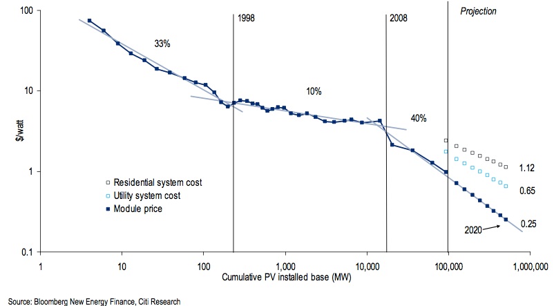
The figure to the left shows the variation of installed cost of electricity generated from solar PV versus the cumulative global production on a log-log scale. Such a curve is called an ‘experience curve’ because it highlights that as the total number of units of a particular technology increases, the cost to produce the technology decreases. Mathematically, it can be represented as:
Ct/Co = (Pt/Po)^(-E) …(1)
where Ct and Co represent final and initial costs, Pt and P0 represent final and initial levels of production and E is defined as the ‘learning index’ of the technology. Using equation 1, the ‘learning index’ for solar PV can be approximated from this graph to be about 0.35. Table 1 below shows the average learning curve for different technologies in decreasing order. As can be clearly observed, solar PV has the highest learning curve, which explains the high rate at which its cost has been reducing over time. [3], [4]
|
Source of energy |
Learning index |
|
Solar PV |
0.35 |
|
Onshore wind |
0.23 |
|
Pulverized coal |
0.12 |
|
Offshore wind |
0.03 |
|
Natural gas |
0.01 |
Table 1: shows various sources of energy and the corresponding learning curves [Original calculation, [3]]
- ‘experimental’ phase, prior to 1988
- ‘industry-development’ phase between 1998 and 2008
- ‘mass-production’ phase, after 2008
The analysts conclude that under the above assumption, a different ‘experience curve’ drives each phase of development as shown in the figure below. Extrapolating the curve of the mass-production phase delivers a markedly different outcome by 2020 than previous projections. It expects this third phase will set the speed for cost reductions in the future. [5]
COMPARED TO COAL?
By the time it takes to build a new American coal facility in the next 6 years, solar PV in the regions with the best insolation will be competitive with these plants. For the purposes of the calculation a 500 MW coal plant is assumed and the cost shown on the y-axis is the ‘levelized cost of energy’ LCOE which is the price at which electricity from a specific source must be sold in order to recover the cost of producing it over the lifetime of the project.
This figure is important since it provides a new issue to think about for financing companies which are planning to invest in a diversified portfolio of energy stocks . In terms of long-term investment, would they rather invest in the tried and tested coal or in solar PV which will be competitive with coal in 6 years time and, on the plus side emit negligible carbon dioxide or particulate matter? [6]

COMPARED TO NUCLEAR?
The average number of years it takes to build a 1 GW nuclear power plant is the U.S. is currently 13 times more than that taken to build a 1 GW solar PV plant. Additionally, according to the figure presented below, by approximately mid-2015, the LCOE for solar PV will be lower than that for nuclear power for a 1 GW plant. Add to this the ‘externalities’ cost of the possible malfunctioning of a nuclear plant compared to the negligible environmental costs of a disrupted solar PV plant and the Solar PV argument gets even stronger.
![]()
Primary Author: Apratim Mukherjee
Primary Editor: Joe Donatoni
Its not my first time to pay a quick visit this web site,
i am browsing this website dailly and take good information from here all the time.
I think the admin of this website is truly working hard in support of his site, as here every stuff is quality
based stuff.
I’m sure some people might not like seeing solar panels on roofs, but you have put up some good arguments as to why solar power is a viable source of energy. I have a cousin who has some solar panels and does as you describe, selling some power back to the power company to offset his own home’s energy use.