Introduction
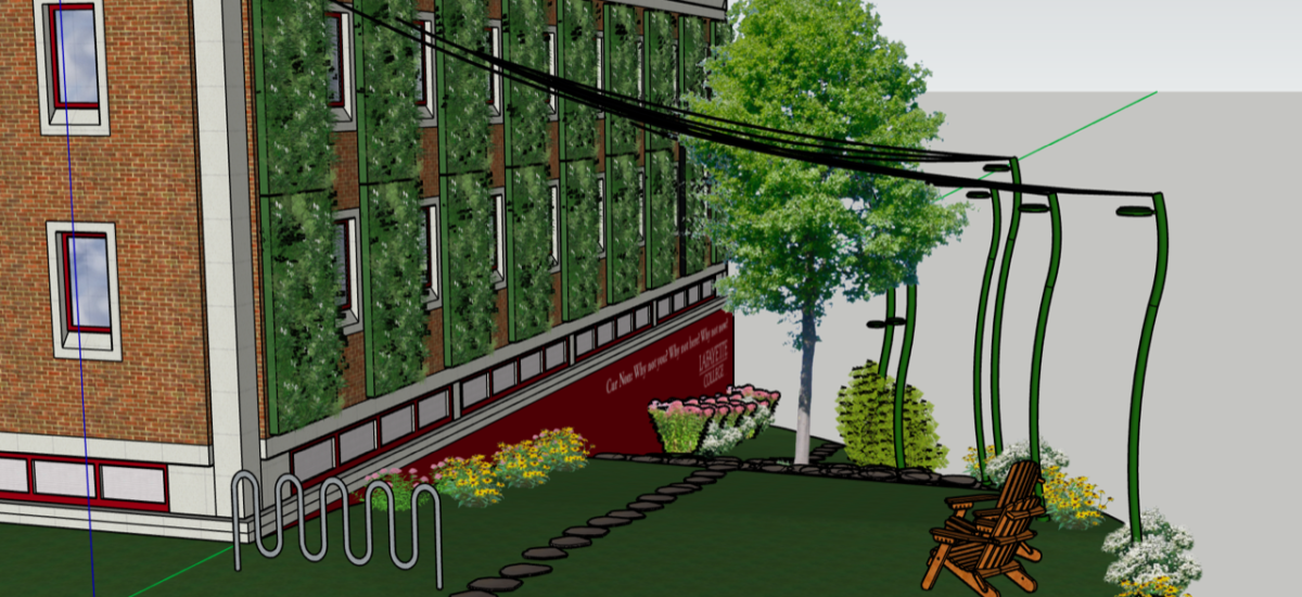
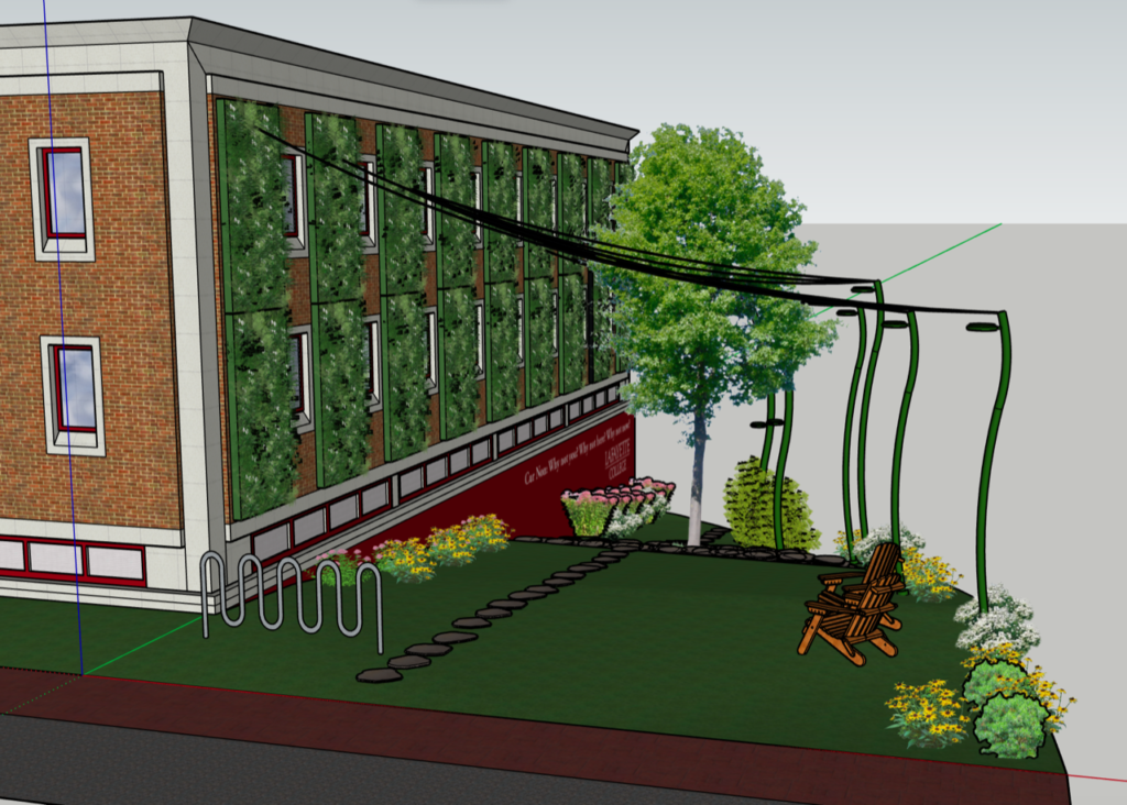
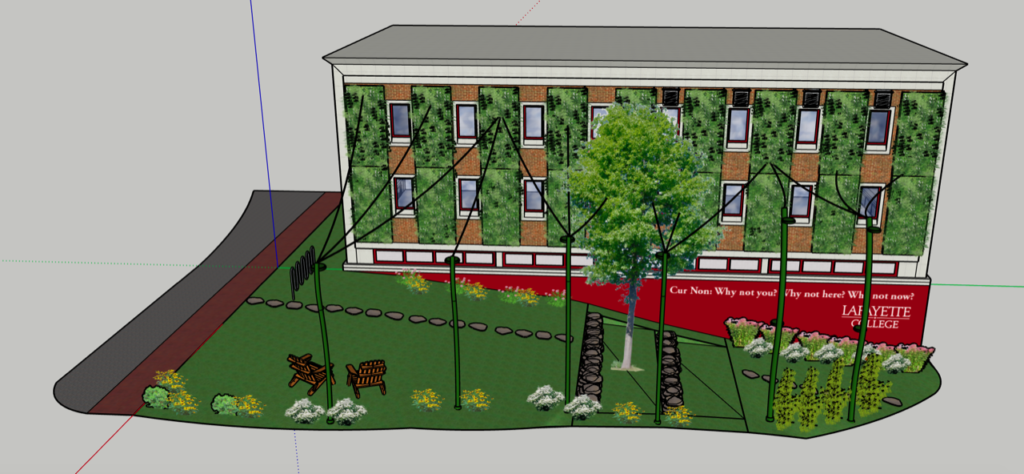
The goal of this project is to facilitate interaction between students from all areas on campus. With that in mind, the project’s first step was to expand beyond the two-dimensional surface of the wall of the Acopian Engineering Center and consider a space that students could inhabit. The team determined that creating a communal space will be the most effective way to facilitate collaborative interactions. The proposal incorporates design elements that will make the Lafayette Gardens a space that students of all majors, faculty, and visiting families will seek out. A SketchUp design of the proposal is included in Figure 2.1. The design proposal is divided into four component areas: the wall, triangle, spires and wires, and the ground surface. This chapter reviews the design motivation, process, and choices the team made as we defined Lafayette Gardens.

Literature Review
Engineering educators have long recognized the need to “prepare engineering students to not simply be analytically and technically capable, but more importantly to be creative thinkers.” Studies have shown that engineering students are not fully comfortable thinking creatively and considering their designs for real-world contexts. To accomplish this, educators and administrators must redefine engineering curriculum. This redefinition should include an increased focus on creativity and innovation to produce well-balanced students within the global economy. Artists and engineers have great potential in working together creatively to solve complex environmental issues (Constantino et al. 2010, p.49-52).
Nature is crucial for cognitive development and the mental and physical well-being of students. Particularly, reduced contact with nature could limit academic performance and success in life. Further research has linked exposure to urban green spaces with improved focus, increased vitality, and reduced stress levels, which could positively affect educational outcomes for individual students. This can be explained with two existing theories: Attention Restoration Theory and Stress Recovery Theory. The first suggests that students exposed to green environments may be able to focus more effectively for longer periods and thus should experience enhanced school performance compared to students without such exposure. The second, suggests that exposure to nature allows for recovery from stress which results in positive feelings related to safety and survival (Hodson and Sander 2017, p.16-18).
To build on the importance of nature, vertical greenery could act as art in public spaces. Increasing vertical greenery technologies on the walls of our buildings create “public art that is environmentally sound.” Both public art and vertical greenery contribute to the quality of life as they “complement each other in terms of its aesthetic, environmental, and economic quality.” Research studies show that a combination of both will create public art that is high in aesthetic quality and environmentally sound (Bakar et al. 2014, p.236).
Our team was motivated by this review of the many mental, physical, and creative benefits of incorporating a living wall into a space. The next four sections of this chapter incorporate the research from the literature review into a design proposal for the wall, triangle, spires and wires, and ground surface. Each of the four areas provides a unique opportunity to incorporate plants, art, animal biodiversity, and relaxation into Lafayette Gardens. The sections outline the art forms the team considered the decisions that the team made, and future design considerations.
Wall
Initially, the team considered a number of different art forms to incorporate into the wall design. These included light, painting, fabric, and plants. Based on the environmental and creative benefits, as summarized in the literature review, plants quickly stood out as the art form to proceed with. Once the team made the decision to proceed with incorporating plants into the wall design, the next consideration was if these should be in the form of a green facade or a living wall. Both systems would achieve our goal of incorporating greenery to the area but in different ways.
A green facade is composed of climbing plants growing vertically to cover the facade of a building. Plants can grow directly on the facade or on a structure independent of the building. More often, a green facade is “composed of a continuous or modular trellis that supports the growth of vining plants installed above, on, or below the trellis” (Nagle and Tamminga, 2017, p.23). Our group considered an independent trellis system, as allowing plants to grow directly on the facade of Acopian would likely compromise some of the structural integrity of the brick facade. A trellis system is implemented by installing planter beds at the base of a wall. The trellis system provides a structure for the plants to latch on to while growing. The planter beds contain all of the roots of the plants and therefore are the only piece of the structure that needs irrigating. One major limitation of a green facade is that plant selection is limited to climbing plants.
A living wall is “composed of continuous screens or modular trays, vessels, planter tiles, or flexible bags that hold the growing medium and the plants” (Nagle and Tamminga, 2017, p. 23). This independent structure allows plants to grow in containers off of the wall. These containers provide the structure with soil, irrigation, and drainage in a single system. Then, plants grow directly in these containers. A living wall system is structurally more complex than a green facade but provides greater flexibility in plant selections. As the plants are potted, any plant that typically grows in a pot and matches the sun exposure level of the wall can be grown.
From a design perspective, the big attraction that a living wall offers, over a green facade, is the ability to incorporate patterns into the wall. A living wall system exponentially expands the plant choice options that are able to grow on the wall. A trellis system would have limited the plant choice to vines and strictly vertical patterns. With a living wall system, the design can incorporate a wide variety of plants which can be arranged in various patterns on the wall. This wide variety of plant choice is important as it allows for four-season flexibility. We are able to intentionally select the plants so the wall remains green during all four seasons. Additionally, different plants bloom during different seasons, so a living wall allows for different patterns to be developed in different colors during different seasons. The team valued this flexibility in plant placement and patterns significantly, which made a living wall a better selection than a trellis system.
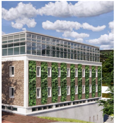
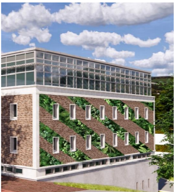
The next consideration was how much of the wall to cover in a living wall and what shape we wanted the structure to take. The team considered four different orientations: vertical stripes, horizontal stripes, diagonal stripes, and a gear-like shape to represent engineering. As a team, we recognized this was a major decision for the project because it will be a key component of the aesthetic value of the wall. The first design we decided to drop was the gear. We did this in order to maintain a collaborative space null of any favoritism towards one specific part of campus. Figures 2.2-2.3 displays vertical and diagonal stripes. Ultimately, the decision came down to what would be the most technically feasible. We determined vertical stripes, between each column of windows, would simplify irrigation, attachment points, and maintain some visibility of brick. Maintaining the visual anchor of the brick on the wall will help tie the building into the surrounding campus. Then, to break the strict linearity of vertical stripes, careful plant choice selection will add color and pattern to the design to help with aesthetic value. We have even thought of incorporating various types of plants that change their appearance throughout the year to paint a different picture on the wall depending on the season.
Triangle
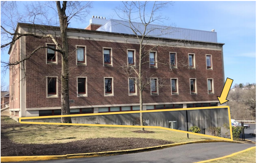
Upon initial observations of the wall, the large triangular concrete block stuck out as an area that was not being artistically utilized in any way. Figure 2.4 displays this space with a yellow arrow pointing to it. Currently, the face is a blank canvas and would be a logical area and a great opportunity to add another artistic component to our design. The concrete triangle sits between the brick portion of Acopian and the grassy hillside, which provides an artistic opportunity to transition between the living wall and the grassy area.
Due to the raw and undefined nature of the triangle, we had a variety of different options that we could pursue in its design. These included plants, a mural, or writing in the form of a free speech wall. Examples are displayed in Figures 2.5-2.7. Our team considered the core principles guiding our design ethos, as we discussed the best way to design the triangle. Because we are most interested in fostering a collaborative space that draws people together and includes as many campus stakeholders as possible, we decided to feature another big audience of the space, admissions! The mural will creatively express the school motto, Cur Non: Why not you? Why not here? Why not now? Figure 2.8 represents a possible mural design. When prospective students and their families arrive at Lafayette, they typically park in Markle Parking Deck. The College is planning on adding another story to the parking deck, so families will have a straight view of Lafayette Gardens. Additionally, when tours exit Markle Hall, the first thing that families see when they look to the right is the Lafayette Gardens area. The triangle is another opportunity to draw the eye and provide an anchor for tour groups and visitors. Our team is confident that the Lafayette Gardens would be a memorable addition to the admissions tour experience. We believe the mural would be a great way to feature a student artist. The exact visuals of the mural will be defined when an artist is selected.
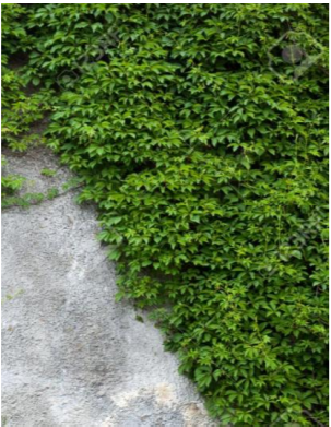
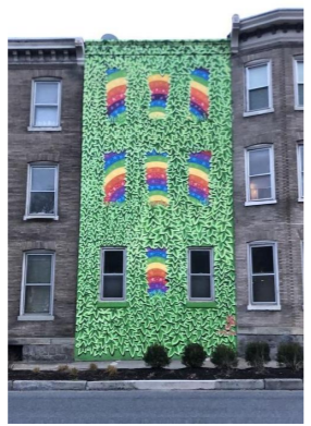
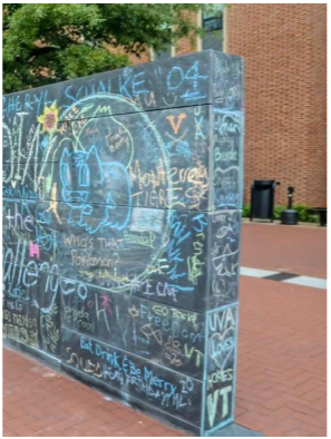
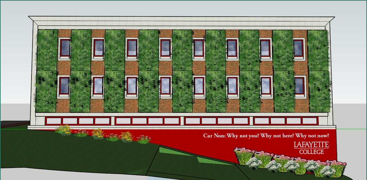
Figure 2.8 – Lafayette Gardens Triangle Rendering: Possible Mural Design. Sholtz, L. (2020)
Spires and Wires
In order to meet the project definition of creating a multidimensional collaborative space, the team decided creating a communal space would be the most successful. If the design proposal was composed of just a living wall and mural, we do not believe students would seek out the space. The team decided to incorporate spires and wires into the space to provide physical definition so the Lafayette Gardens feel like a destination to walk through, relax, and learn. The team anticipates that connecting six spires along the road to the wall with thin wires will create a canopy. We believe students are more likely to seek out the area as it will feel like a three-dimensional communal space. This section of the report is composed of a design analysis of both the spires and wires. There are two components to this section. Chapter 3: Structural outlines the technical feasibility of the spires and wires in greater detail.
Spires
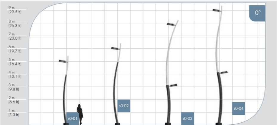
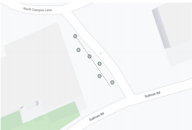
For the spires, incorporating six curving spires into the space will add an artistic statement to the space while also providing definition to the space. Figure 2.9 represents a possible curving spire selection. Then, arranging the spires 12 feet apart in a snake-like pattern curving along the road will combat any fence-like feelings to maintain the area as an inviting space, as displayed in Figure 2.10. The six spires represent the six different disciplines of Engineering at Lafayette. Increasing the height of the wires as the hill slopes down will scale the space down to create a welcoming entrance while opening up the space as the user enters. The spires allow the opportunity for light to be included in the space. As part of this project, the team did not investigate the logistics of this. As the project moves to the next phase, additional planning should be completed to extend the space and incorporate more spires into the design. The team does not anticipate these spires being connected to wires, but instead to expand the space of the gardens and invite students in.
Wires
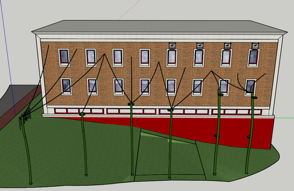
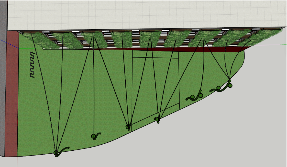
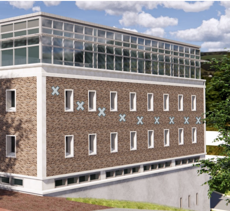
The team decided to connect the six spires to the wall of Acopian with thin wires. This will create the idea of an enclosed space without actually closing off the space. Selecting a thin 1/8th inch wire will allow vines to grow across the space while minimizing the weight of the load that the wall and spires will have to carry. Our team proposes that a wire be connected to the wall of Acopian in each section of the living wall. The living wall will mask the attachment points, so the metal bolts are not visible. The team decided that we would not limit our design considerations to one wire per living wall section. That being said, the team wanted to be conscious of the structural limitations of the spires. Since there are six poles to attach the nine+ wires to, Lisa Sholtz developed a wire pattern to balance symmetry and the structural limitations of the spires with the creation of a semi-enclosed canopy feeling. The pattern is represented in Figures 2.11- 2.12. The 14 wires will connect to the wall in a 1-1-3-1-2-1-3-1-1 pattern, while the same 14 wires will connect to the spires in a 3-1-3-3-1-3 pattern. Additionally, to maintain a consistent height to the canopy, we propose attaching the wires to the wall of Acopian in a parabolic curve. Figure 2.13 represents these attachment points on the wall. Additionally, these wires will provide an opportunity to grow vines across the space. We believe this will further solidify the natural elements of the space. Our team recommends that further research be done on an implementation plan for growing vines across wires.
Ground Surface
Once the scope of the space was established, the team focused on maximizing the functionality of the area and aligning it with the sustainability initiatives of the College. Our team viewed the ground surface as an area to connect the space to the surrounding campus area. By using similar materials to Skillman Library, similar plant selections to the pollinator gardens that will be located in front of Acopian, and similar seating choices to the quad the area will be well integrated within the greater campus. There are three additional primary components within the ground surface plane: a stepping stone pathway, native plant gardens, and seating.
Path
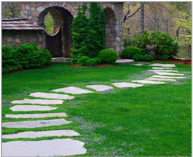
One of the current primary uses of the space is to provide a pathway for students traveling down to the sports complex. This is apparent by the worn grass path in the existing landscape. The design proposal includes the pathway as an intentional and functional component of the space. As there is a sidewalk on the other side of the road leading down to the parking deck, a stepping stone path is the best way to create an intentional, but informal, pathway. An example of this is represented in Figure 2.14. Pennsylvania Blue Stone will tie the space into its surroundings by connecting the space to Skillman Library and use a locally sourced material.
Gardens
Adding native plants to the ground level will maximize the positive environmental impact the space has. This will provide critical habitats for pollinators. Aesthetically, the plants will add color and texture to the space. The team proposes that pollinator gardens be placed in front of the triangle and around the spires, as displayed in Figure 2.15. As different plants are alive and blooming during different seasons, this will add another seasonal dimension to the space. Chapter 4: Environmental will discuss the specific plant choices, layout, and benefits of incorporating additional plants into the space. Our team proposes that hedges be incorporated into the space to provide acoustic separation between the Lafayette Gardens and the road up from Markle Parking Deck. As the project moves to the next phase, additional research should be done to incorporate acoustic separation into the space.
Seating
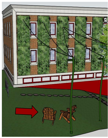
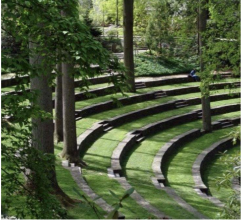
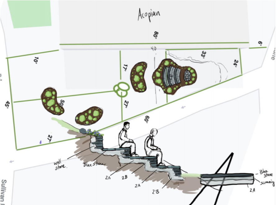
To further solidify the purpose of the space, there are two forms of seating in the space. Adirondack chairs will provide comfortable seating and tie into the aesthetics of campus, as they are sprinkled across the quad and various courtyards. As the area is situated on a hill, we propose these Adirondack chairs be placed in the area near the sidewalk, as represented in Figure 2.16. Further, two terracing notches will function and appear like a small amphitheater. Constructing this out of Pennsylvania Blue Stone will create further unity in the space. These terraces are inspired by the Scott Outdoor Amphitheater at Swarthmore College, as visible in Figure 2.17. The team has been in contact with Paul Deery, a landscape architect, to further develop the plan for the space. As represented in Figure 2.18, Deery takes our design proposal and further develops the gardens and terrace structure and orientation. The digital sketch develops three terraces with a flat area for outdoor class instruction. In the next phase of the project, our team recommends that the College should follow up with Paul Deery to develop a more refined design proposal.
Conclusion
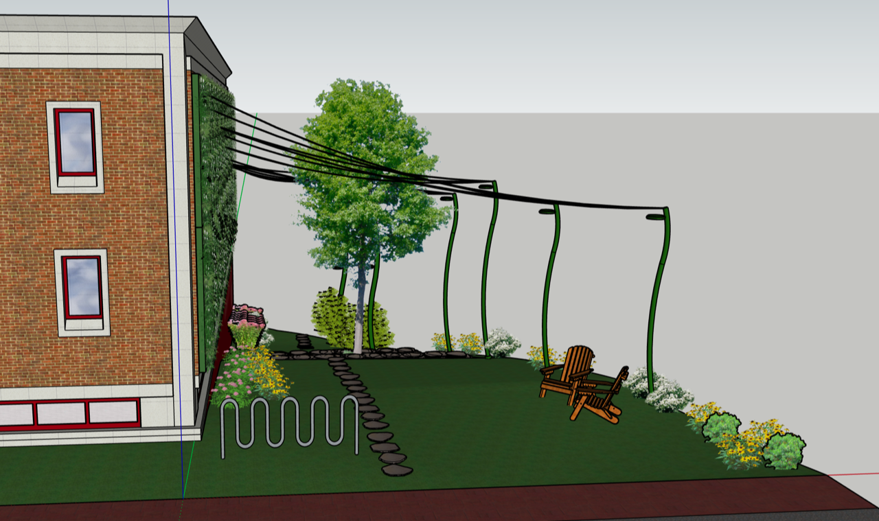
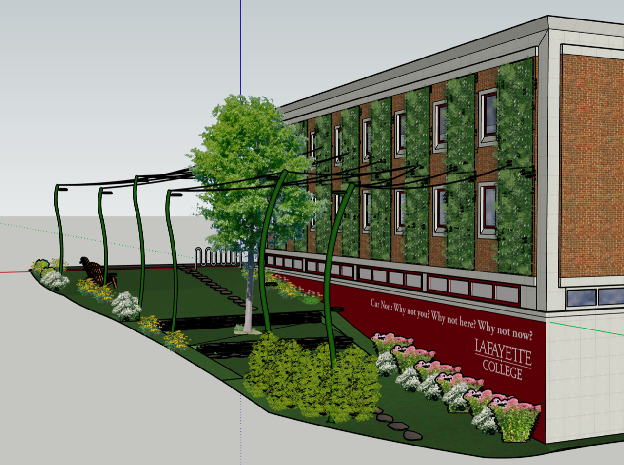
Each of these components as they relate to structural, environmental, and financial considerations are discussed more in-depth in the following chapters. In the next phase of the project, Our Team recommends that a landscape architect is hired in order to further refine the design proposal and investigate adding additional spires to extend the scope of the space, adding hedges between spires to increase acoustic separation, growing vines up the spires and across the wires, and adding light to the space. Design renderings were prepared using SketchUp Pro 2020. Figures 2.19-2.21 model a view of Lafayette Gardens from High Street, Markle Parking Deck, and Markle Hall. These represent the view a student walking to class, a professor exiting Markle Parking Deck, or a prospective student beginning their tour of Lafayette College could have. The technical feasibility of this design proposal is included in the following chapter. Later chapters detail the environmental and financial considerations of the project.
Click here to proceed to Chapter 3 – Structural
