Image edited by Lisa Sholtz – March 2, 2020
With only one week left before the midterm update, the Greening Acopian project team has begun the critical process of deciding on a final design for the project space. On Monday, March 3rd, all six members met with the goal of reaching an agreement on several visual aspects that had yet to be finalized including the living wall pattern, the placement of the poles and chords, and the inclusion of a path. Using a presentation developed by Artistic Design Director, Lisa Sholtz, the team voted on various alternatives, reaching unanimous decisions on some but remained split on others. Below is a summary of the options and decisions that were covered during this meeting.
The Living Wall Pattern –
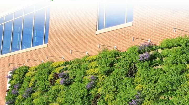
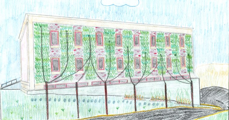
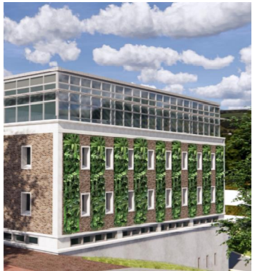
The debate over the living wall’s appearance has been ongoing since the first week of the semester. In the original capstone report from 2018, the living wall was designed to have a vertical shape that would fit between each set of windows, excluding the edges. With this as the baseline, Sholtz and the other members developed several variations including the idea of covering the full surface of the wall with plant life, alternating every other column with greenery, using horizontal lines between the rows of windows instead of the initially proposed vertical appearance, creating an image out of the plants on the wall, and using a diagonal line design. By the day of the meeting, the options had shrunk to the initial capstone design, the same design but with the edges included, the alternating pattern, and the diagonal pattern. The capstone and alternating pattern designs were eliminated, followed shortly by the diagonal after it was determined that it would not be as feasible given the current project. In the end, all members were in favor of the vertical strips running along the span of the east wall as pictured above.
Chord Placement and Design –
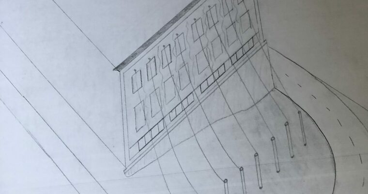
Due to the desire to extend the living wall into the surrounding space, the current design calls for several chords that will connect various points on the east wall to poles that will be placed at the edge of the grass area. Though it has been established that these chords will be covered with some type of greenery, uncertainty remained in regards to the placement of these points of connection until Monday . During the meeting, Sholtz proposed three options for attachment locations on the wall, the first had the points move horizontally across the top row of brick (above the top row of windows), the second had them placed along the middle row of brick (between the two rows of windows), and the last suggested they move in a diagonal from the top left corner to the bottom right. After some discussion, Project Manager, Professor Ben Cohen, suggested a slight curve in the connection points such that it started in the top left and gradually curved such that the last point was in the middle row on the far right. The new option proved to be the most popular and thus will be used in the developing project plan.
The Pole Debate –
Following first two decisions was the topic of height and positioning for the poles that would be located on the opposite end of the chords. While the earlier topics had been relatively easy to settle, the debate about the poles proved to be much more difficult. The first item of business as pointed out by Structural Engineer, Major Jordan, was to determine the desired maximum height for each pole: would it be preferable for all the poles to reach the same point in the air, or should all the poles have the same height and therefore a sloped appearance that would match the slope of the land. After considering both options, Professor Cohen provided an additional suggestion of having groups of poles with the same height such that there would be a visible slope downward, but one of a less drastic measure. With all three of these options available but uncertainty as to which would function best, the group determined to delay making a final decision until more input and information was collected after the midterm update.
The second issue had to do with the spacing and placement of the poles which was also left unresolved due to a split vote. Although everyone agreed that the poles cannot be so close together that they resemble a fence, discussion emerged when it came to deciding whether the line of poles should wrap around the space and extend to another area of campus or remain strictly in the project area. For some in the group, the extension has appeal since it can make the area seem more connected with the campus. But for others, the idea of extending the line holds the possibility of having a choppy appearance that could ruin the space’s appearance created by the redesign. Due to this difference in opinion, this topic was set aside with the plan to reconvene at a later time and reconsider the issue.
Deciding on a Path –
The idea of adding a path from the top of the sloped area to the base is a recent addition to the design having been inspired by the makeshift walkway formed frequent usage as students walk down the hill for a shortcut. Since it was a strong suggestion, the team happily accepted the idea and only needed to decide on the type of material to use: brick or Pennsylvania blue stone. Through a quick discussion, it was determined that the use Pennsylvania blue stone in a stepping stone path down this slope would be the best option. The material differed from the brick paths seen all over campus, but since it is the same rock as used in Skillman library it could still successfully connect the project space to the surrounding campus.
The Concrete Triangle –
The remaining topic from the meeting is the concrete portion of the wall located between the brick portion and the ground. Due to its worn appearance, the space was deemed a location early on that should be touched up, but the question remains how should it be done? Sholtz presented three options to the group: adding additional plant growth to the area (either on the wall or in the surrounding ground), adding a painted mural to the wall, and creating a free-expression wall that would allow students to draw or write on it throughout the day. The third option wall was eliminated from the debate out of concern for the challenges that might arise, but the decision between the use of plant growth or mural remained undecided due to a split vote. As a result, it was concluded that the team would revisit it after the midterm presentation once the audience has had the opportunity to provide feedback.
By the end of the hour-long meeting, the team had successfully narrowed its design to a handful of options which will be presented to an audience on March 11, 2020. By the end of next week, the plans for the wall will hopefully be near final which will allow the team to proceed forward with the next steps including creating a model of the wall and a final report.


