Professor Prabhu’s ES101 Design Course: Group One
Majors/Graduating Class
Mikyle Alam – Economics and International Affairs, Class of 2022
Matthew Cammeyer – Mechanical Engineering, Class of 2025
Joanne Sarmiento Santillan – Civil Engineering, Class of 2025
Arthur Shirk – Mechanical Engineering, Class of 2025
Hayden van Steyn – Mechanical Engineering, Class of 2025
AutoCart
Our engineering team was tasked with designing a product to improve the grocery store experience, we decided to focus on the customer’s experience. We carefully walked through each phase of the design process, thoroughly delving into research and development before presenting our finished product. Our project was the AutoCart, a shopping cart outfitted with RFID scanners and a touchscreen interface. The user will be able to scan items as they move throughout the store, allowing them to avoid lengthy checkout lines and save valuable time at the grocery store. Learn more about the design process down below.
Research
How
Which methods will we use to collect our users’ needs?
- We will use site observations and surveys to inform our study/project. Site observations can provide technical data for the problem that is being addressed, but sample a small audience. Surveys can be used to collect data from a broad audience, but do not offer in depth answers or allow empathic interactions.
Why did we pick this method? What are the anticipated advantages / disadvantages?
- We picked these methods because our project intends on primarily making the users experience in a grocery store as quick as possible. The aforementioned methods will allow for us to establish a baseline average for how long individuals spending in a grocery store giving us a metric through which we can gauge if our product is beneficial or not,
Who
Identify five or more individuals who fall in your user group?
- Students
- Parents
- Elderly individuals
- Professional shoppers
- Families
What are their demographics?
- There is no specific demographic for who shops at grocery stores, however, because Giant (the closest grocery store) demographic is largely middle class our data will be from the same demographic.
How will we access them?
- The surveys we will use will be distributed amongst different groups at Lafayette.
- The site observations will be done outside of Giant in Easton.
Where/when
Identify a location where we plan to interact with these individuals.
- Giant Foods
When will we interact with them – in a group or as individuals?
- The surveys will be administered via a link that will take people to the survey; therefore, it will be administered individually as only one person can take the survey at a time.
- The site observations will be done from outside of Giant. We will tag people walking in to the grocery store based on what they wear and time the amount of time they spend inside the store.
What
List of 10 questions and observations we want to get from our users. Questions were generated with the intention of distribution via the survey.
- What is your occupation?
- How long on average do you think you spend in a grocery store when you go?
- Do you usually tend to have trouble finding what you are looking for?
- What is your least favorite part of shopping for groceries?
- What is the most important aspect for you when buying food: efficiency, cost, health, etc?
- What is your favorite grocery store and why? What makes it different from the rest?
- Do you usually come into the grocery store with a specific pre-made list or wander around more and just pick out what looks good to you?
- What is one thing you would change about the shopping experience?
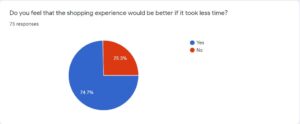
- Would you enjoy shopping more or less if it was streamlined and took less time?
- Do you find it important to walk through areas where you are not purchasing anything? (ex. walking past the bakery to get to the canned goods)
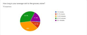
Data
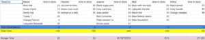
Onsite Observations:
Dates observed:
Oct 26 – 1:00 PM to 2:15 PM
Oct 27 – 3:10 PM to 4:25 PM
Observation Method: Research was conducted using on site observations. Our group broke up into two teams on 2 separate days. We sat between the entrance and exit of the Giant grocery store in Easton and timed how long people that we tagged using the clothes they were wearing spent inside the grocery store. The timing was done using iPhone timers or equivalent android applications.
Data Gathered:
 Survey Observations:
Below are some data tables generated based on our survey analysis of problems with the grocery store experience. We have included the most relevant data that was utilized in furthering our design process, data that became either irrelevant or was not helpful in our researching has been excluded.
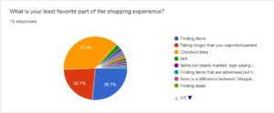
Also, important to note are some of the answers to open-ended survey questions:
- When asked what aspect made their favorite grocery more appealing than others, 34 of 69 responses indicated convenience* and ≈20% of all responses specifically used the word convenience
- When asked to change one thing about the grocery shopping experience, 24% of those surveyed responded asking for faster checkout lines, less time spent in the store, or even no checkout lines at all
*All of the selected (34) answers indicated convenience and less time spent shopping/driving, for example: close to home, easy to navigate, memorable product locations, etc.
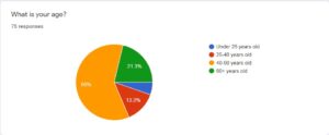
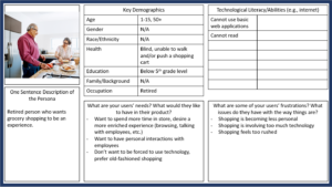
Key Demographics
Persona: We created an ideal persona that would be our target user. We used this tool to help us understand our customer, as we tried to make it accessible to the widest possible audience. We also made sure to note certain groups that our design would not apply to so that we can acknowledge those flaws.
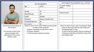
Excluded Demographics:
- Excludes the elderly (post-retirement) – do not want faster store experience, prefer relaxed to rushed
- Excludes those with technological illiteracy – cannot interact with the cart screen
- Excludes the visually impaired – cannot interact with the cart screen
Should include multiple languages to be more inclusive of minority groups
Anti-Persona – a tool used to condense information about those excluded from our design’s potential user base, similar to the persona
Design Goals
Our group used the chart below (format courtesy of Professor Prabhu) to help quantify our goals for this project, coming up with both constraints and objectives for our design. We also developed metrics to test our design against and determine our success.
| User Need | Functional Requirement | Type (Objective or Constraint) | Metric (how will it be measured?) | Specification
(target value) |
Priority |
| Durability | Needs to be able to hold up to rough use, long life-span | Objective | Can sustain X amount of pressure | Being dropped/metal smashing into it | 5 |
| Expedited checkout | Needs to be able to recognise and scan items when deposited in cart | Constraint | Able to identify X of items placed in cart | ~100% | 1 |
| Cash and/or card option | Needs to allow for customers to be able to choose payment type | Constraint | Able to read X different cards | all | 2 |
| User-friendly interface | Needs to be well organized and reliable software | Constraint | X amount of people able to use well | 75% | 3 |
| Language selection | Able to translate into multiple different languages | Objective | Has x amount of language options | At least 5 | 4 |
At this stage in the design process, our group had 5 proposed solutions:
- Faster check out (touchscreen cart)
- Quicker shopping experience (GPS tracking)
- Uploaded shopping list to cart
- RFID scanner in the cart (scans items as they are placed in the cart)
- Inventory tracking
We utilized a Pugh chart (see below) to help us determine which design we would focus on as we moved forward. We compared our 5 different solutions using 5 functional requirements weighted according to priority in our design. This allowed us to determine which designs were the best at meeting design requirements and consumer needs. We then used this information to determine which designs we would move forward with.
| # | Functional Requirement | Weight/Priority | Touchscreen checkout | GPS tracking | Upload Shopping list checkout | RFID Scanner | Inventory Tracking |
| 1 | Reduced time in store | 40 | ++ | 0 | ++ | ++ | – |
| 2 | Cost efficiency | 20 | + | 0 | + | – | + |
| 3 | Customizability | 5 | + | 0 | + | — | — |
| 4 | Durability | 15 | + | 0 | – | + | + |
| 5 | Ease of use | 20 | + | 0 | + | +++ | – |
| Total + | 80+20+5+15+20 | 0 | 80+20+5+20 | 80+15+60 | 20+15 | ||
| Total – | 0 | 0 | -15 | -20-10 | -40-10-20 | ||
| Total Score | 140 | 0 | 110 | 125 | -35 |
After analyzing this chart, we decided to combine our top two ideas (Touchscreen checkout and RFID scanner). With our design unanimously decided upon based on our research and goal analysis, we were ready to move onto the next step…
Prototyping
Prototype Planner –
We utilized Camilla Hansen’s Prototype Planner in developing our prototype model. Below you can see it divided into different sections for each phase of our prototyping process.
Frame
| Purpose | Desired Outcome | Focus |
| Desirability (human), is our design easy to use and will people want to use it in the store? | Evaluation, we want to troubleshoot our design’s interactable interface in order to make it more intuitive and create a more pleasant shopping experience | The screen/user-interface |
Build
| What to Build | Build Plan |
| Level of Detail/Realism: 4 out of 5
Prototype must flow smoothly and complete all the users’ needs |
Use Google Slides to simulate the user interface. May have difficulty interacting with certain features as if it were an actual application (clicking buttons, scanning, paying, etc.) |
Test
| Test Plan | Results |
| Tested by our classmates, professor, and his senior design students. Had users interact with the application as if they were using it in the grocery store. | Does our design have an intuitive layout? Open to any feedback from users to make our design easier to use. Test is successful if users can seamlessly simulate their shopping experience with minimal difficulties. |
Act
| Insights | Actions | Evaluate Test |
| People had difficulty clicking on the buttons, it was unclear what the purpose of the cart was
“Why am I using this?” Paying with card slide sent users to the wrong slide if clicked in certain places |
Made buttons larger and made sure that clicking on text box still functioned properly
Elaborated purpose on welcome screen Resolved issue with card slide going to wrong location |
Success: ⅘
Further testing required, not too far from final product |
Our prototype provided us useful information to improve our design. After modification, the simulation did everything we wanted it to do, users were all able to successfully simulate the shopping experience and enjoyed the design. We were able to address all of the flaws that came up during testing, most were simple flaws such as buttons needing to be more clickable. We also decided to add some modifications based on feedback we received from our professor and his senior design students, the most significant being the visible inventory. We did two total rounds of testing before arriving at our final design. The first round was with fellow classmates and our professor, after which we made the buttons larger and easier to click, as well as addressing a simple slide malfunction. The professor recommended that we make it more clear why the user should be using the product, so we addressed that on the welcome screen of the application. We then tested our revised model with our professor’s senior design students and their advice led us to include an inventory list and notice a transition error. Following these revisions, we arrived at our final design…
Finished Product
Our project is not going to be developed further, however in a real-world setting we would be using our current model to make a marketable sales pitch for companies to consider funding the rest of our design process. We would also need to design a proper screen mount and develop a proper interface using app design before moving to manufacturing and distribution. There would be several more rounds of testing necessary before we would reach that point in the process. While we are far from having a final product, our Google Slides simulation serves as the tangible conclusion of our design. Follow the link included below to experience the Autocart simulation for yourself:
*(Presentation was converted from Google Slides to Microsoft PowerPoint to be uploaded to website)