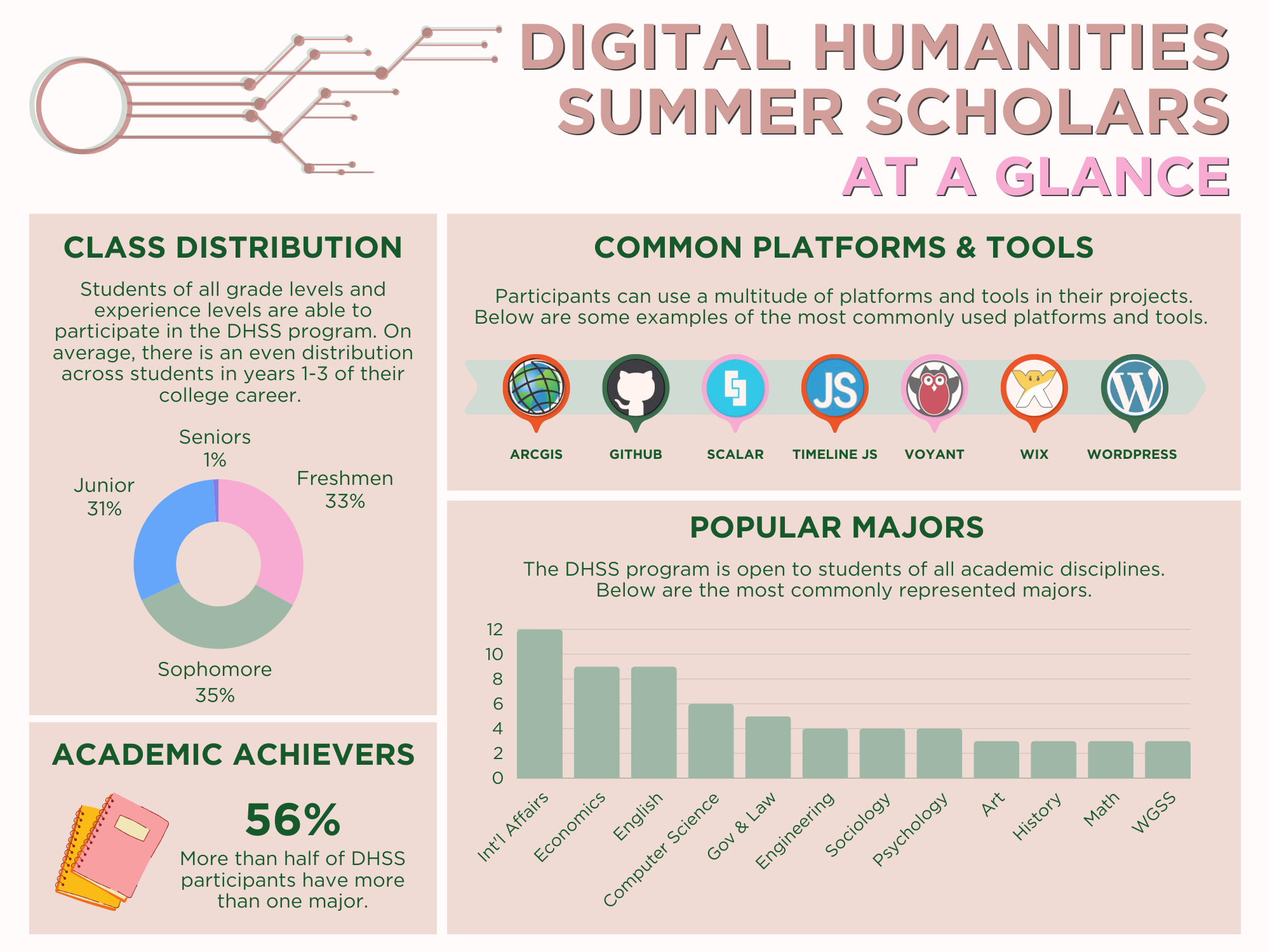
Reflection 3- Sound Studies

Reflection 3- Sound Studies

From meeting with Gettysburg college’s Digital Humanities program and discussing Digital Humanities with visiting professors, I have begun to think of how my interests fit into the larger field.  I have recently learned about the burgeoning field of “sound studies” from a few professors.   Sound Studies is an interdisciplinary field which looks at the many different ways sound has differed throughout history through two main approaches: the cultural anthropological approach and the scientific technological studies approach.  I think my project fits well into this field because it examines the progression of synthesized sounds throughout the 20th century and uses both an anthropological lens and a technological one in the presentation of its content.

One of the visiting professors mentioned a growing interest in initiatives to archive sound as cultural history, just as one would with literature or visual art.  I am going to do more research into this field to see if it could be a match for me in future years.  Learning about the field of Sound Studies has also stressed the importance of continuing with my project after the official deadline for the program by keeping it up to date as sound slowly but inevitable evolves over time.

Monumental Reflection, 3

Finally, I am content with how things are turning out.

I have compiled a list of all the books I wish to use, and I am in the process of extracting valuable information from them. Thanks to that, I have created what is, in my eyes, a well-written 6-page outline of how I see my paper and research argument to be. Sarah and Mr. Clark have emphasized the importance on narrowing down my scope, so for now I have confined my 10 case studies to 4 countries only – Poland, Bulgaria, Ukraine, and what was once East Germany.

Taking into consideration Sarah’s suggestion of narrowing it down to only 1 country, 4 may still seem like an unaccomplishable overkill, but I have taken into consideration that monuments are not demolished or vandalized every single day. Additionally, in some cases the treatment of monuments that I am planning to analyze has been tied to the same political event – a political event that has sparked outrage internationally. Thus, in my eyes the project is not and should not be seen as an examination of the political relations of 4 countries and Russia. Rather, this project aims to show that although monuments aim to preserve a time in history, to make permanent someone or something that is fleeting, the treatment of these monuments depicts instability, rather than permanence. And this instability is based on fluctuating social and political events, which I see as a smaller scale than political relations! Monuments are undeniably tied to history – consequently, to ideology and values – and so the ways in which they are viewed and treated changes according to what lens history is seen through.  Because this lens changes due to its relationship with the political and social scene, I aim to prove that the way communist monuments are valued changes in the same way.

I have started working on narrowing down which monuments I want to use as case studies, but I will continue researching what is controversial. Additionally, my aim is to expand my total database to 300 monuments by the aim of this week. However, I need to emphasize the importance on the case studies, rather than on the supplementary database itself. That being said, I will try to choose my final case studies by the end of the week as well, and start gathering information on them. I will simultaneously be uploading this information on the WordPress platform that I started creating, and when I have gathered enough, I will start my analysis and incorporate it into the final paper, as well.

On a brighter tone, it’s Monday! The start of a new week, which will be fuelled with new energy and enthusiasm. I’ve got this!

Reflection 3

The past week has been very productive in shaping my project but also extremely stressful. For me, changing my project topic to make a more specific argument and analyze a smaller scope has initially felt like a huge compromise and limitation. However, after reformulating my argument a bit, I actually really liked the direction I have gone in of using Ibn Battuta’s travels as a lens through which I can illustrate the cultural and economic interconnectivity of the Indian Ocean world. While I was pretty excited about moving in this direction, I have faced more bumps in the road after speaking to a librarian about hashing out my argument. While the lens was narrowed, my argument was still said to be too broad or too big for a DH project and more like a dissertation. I struggled a little because I felt as though the Indian Ocean in general is seen as too big to analyze and therefore I must choose a specific region or city. This I feel really takes away from my project as the point is to illustrate a mobile maritime community that isn’t founded only in one region. However, I realized that I can still use a case study to make a broader argument about the roles of Hadramis in Indian Ocean port cities and still also utilize Ibn Battuta’s travel descriptions of these cities. After updating John Clark on this new trajectory, I felt a lot better about this switch and I don’t have to make too many changes to the map I will be creating in ArcGIS as it will mostly serve as a background illustration for information that I will bring to life in Neatline using pop-ups and the timeline.

Another positive has been that compiling data for Ibn Battuta’s travels has been far more easier and focused. I messed around a little bit with ArcGIS and was able to reorient the Indian Ocean in Yemeni-centered way fairly easily, so it seems that with the help of John making my base layer maps won’t be extremely time consuming as long as my data tables are well structured and documented. Moreover, after looking at some Neatline tutorials I can really see my project come into shape; now it’s just about executing my plan. I think my maps and Neatline annotations have a lot of potential and I have compiled a majority of my data which makes it feel more possible. I am considering learning HTML because I am not really pleased with how my Omeka site looks, but if it becomes overly time consuming I might have to make another sacrifice. Overall, I have been facing a lot of challenges both in terms of my argument and how I want my site to be built; however, I have been rolling with the punches and I definitely can envision my project with a more realistic lens than initially. I also feel that the compromises I have made will pay off in the long run and it will be something I will probably be more aware of after the fact than in the moment.

Reflection 3 — Supreme Court

This week has really made me realize how much I need to buckle down and get to work on my data collection and building the tools. I think right now I need to work on building a web scraper to get collect all the Supreme Court documents I need online, and put them into text files for each justice. I found a website in which the URL of each case mimics the docket number, so now I just need to write a code that will collect the documents. This should be fairly easy to do, but I will need help from computer science professors. However, that is what I will spend most of this week doing. Since I already have a lot of my research done and some of my literature review written (because my outline consisted of parts of my literature review), it shouldn’t be too hard to dedicate my time to building the code for this part of the project. After that, I just need to run the topic modeling analysis on MALLET—which I already did with the sample text MALLET came with. So, that should be fairly easy to put together. My goal for the end of the week is to have successfully collected by data and to begin the analysis.

Reflection three

Regarding my project in the past week, the amount of stress/pressure I feel has definitely gone up. Creating my data set has taken up a large amount of my time, but I successfully have finished creating my original 2010s index and now I just need to edit the older index. Surprisingly, the editing of the old index is looking like it may be more time consuming than creating the new one, which is a little worrying. However, there is not much I can do to avoid that besides just work! Additionally, I have gathered many sources that should lend themselves to a robust literature review. Now, I just have to write it all–which should be an interesting process. I have also started working very minimally on my Omeka site, which I enjoy because I like to design. I have been thinking that after doing my topic modeling, it would make the most to use my time to make a timeline instead of a Neatline exhibit.
Aside from the stress of the time I have left, overall, I have been enjoying what I have been doing quite a bit. Going through The Lafayette has been extremely fun for me, especially seeing what is being written about and also just learning more about Lafayette as a school. I’m a little apprehensive about using software and creating a visualization, but I have ideas for making it a little more manageable for me. Also, I decided I also want to make some graphs as well because some of the data that I want to include lends itself to a more traditional visualization. One of the coolest things though is that I put the 2010s index into Cytoscape to portray a certain visualization (because I want to create multiple visualizations) and it looks awesome and is doing what I want it to do! So I am excited.

Reflection 3 – Tools and Challenges

I have been increasingly frustrated with using google maps. The more I try to do with it the more I feel it is not going to be the path I want to take for my project. I have begun working with Tableau and using that to generate maps. I really like tableau although it is also challenging to use. At least with tableau I am satisfied with the way the map is starting to look. I have input data for endangered species from 2008 and 2015 for all countries and islands. Now when you scroll over the countries it displays this information with the percent increase for the number of endangered species. I am currently working on trying to figure out how to create different colors for the percent increase for each country. I want to code the map based on which countries are experiencing the most species under threat. So I am currently working on trying to figure out the best way to do that. In addition to that I want to create a graph that interacts with the map. Tableau allows you to do this but I am having difficulty so far generating one. I plan to keep reviewing the instructional videos to figure out how to create a graph the way I want it. The only other challenge I am facing is having too much information and narrowing it all down to be more concise. I am trying to include a human factor to show why all of my data has increased over the past 7 years so I am thinking of incorporating not only human population, but maybe deforestation and pollution/emissions data as well.

2016 Tool Reviews

Find three digital tools that you might use in your project. Provide a link, a summary, and both positives and negatives.  Include whether it has platform restrictions or limitations. Order the tools from most useful (the one you will demo for the class) to least useful for your project. If that distinction is difficult to make, note why.

Caroline Nawrocki

Cytoscape

The first tool, and most useful tool in my opinion that I plan to use in my project is a software called Cytoscape. It is an open-source, Java based software for data visualization. It does not require me to learn additional languages; however, I do think it can help. However, there is plenty I can do without languages. The tool interacts with Excel or csv files–basically spreadsheets. It then takes the info I put in the spreadsheet and I choose how these columns are connected to create a network visualization. It is highly customizable in terms of how you make your design look, but this leads me to the level of challenge Cytoscape will bring me. There is a lot I want to do in terms of topic modeling and I can probably do most of it with Cytoscape. However, it is not a very intuitive software, at least not for me, so I’m definitely going to need to spend a lot of time getting used to it and learning how to make it do what I want. It does visualize the answers to my essential research questions.

Heurist Data Manager

Heurist Data Manager is an open-source online database builder. It does not require outside programming, and makes that a main point of what this is trying to do. It take metadata in spreadsheet form and puts it into a database where you can then create networks, maps, and show relationships between your data. It is customizable in the sense you can do a lot with the visualization of the data and the database adapts easily. It also works well with multiple kinds of web publishing. Like Cytoscape, since it deals with a lot of data it will take some time to get used to manipulating all of my data and messing around with the program so it will be a challenge at first. However, unlike Cytoscape, this program is less geared toward science researchers and also has a lot more helpful tutorials. It also is geared toward non-programmers. This would help visualize my essential research questions. The reason I have this listed second to Cytoscape is because I am more familiar with Cytoscape, but I am curious if Heurist is more fit for me because it is designed for humanists who cannot program.

Neatline

Neatline is an “exhibit-builder” for humanities work. It does not look like extra languages is necessary to work with the software. In the situation I would want to do, my “data” would be documents that I’d upload. Then, the software would allow me to use those documents as exhibits that would have interactive annotations. It is also customizable and is meant to work as a plug in with Omeka–so I would have to use Omeka as my platform if  I chose to use Neatline. This software does not seem too difficult to use, especially since my ultimate goal with using this software is pretty straightforward. I would only need to upload the various newspaper pages I want to use as exhibits. I will also probably use this only if I have extra time to add things to my digital project. It would not be used to answer my essential research questions, but in fact just enhance my overall visual depiction of my project.

Jillian Fahy

Wix

www.wix.com

For my website platform I am using Wix, which is an online website creator program that has many tools to generate a webpage. What I am most excited about is the blog page feature that I have been working on. I created three categories using wix for a blog to go along with my map. I have a “project blog”, “importance of species” section and “extinction spotlight”. This blog feature is a really great way to get out information and make the webpage more interactive. For creating the blog section there is a tool that allows you to generate different categories. After you have made categories you can begin building the blog by selecting a category and creating a post. As you created the posts the tool allows you to insert pictures and videos that you can embed right into the text. I really like the way the videos show up as you can play them without even fully opening up the whole post on that topic. I also used the tool to select “Featured Posts” that will show up on the side of my webpage on any page that the user clicks on. I then am able to select which specific posts will show up in this featured section. I have not previously used wix but have found it moderately easy to figure out by simply experimenting and playing around with different buttons on the webpage.

Google Maps

https://www.google.com/maps/d/u/0/edithl=en_US&app=mp&mid=1YddiWJxGlKN2MBjcL2cShIJtfBs

After meeting with John Clark I have gained a bit more knowledge on how to use google maps. This will be very helpful to my project because it will allow me to add layers to a map in order to show change in endangered species over time, as well as add a layer to show urbanization/land clearing data. Although I have not totally mastered Google Maps to date I have future meetings with Mr. Clark to continue learning it further. Using google maps I will be importing geospatial data from the IUCN redlist and converting it to KML files so that google can process it. The maps are very versatile and I will be able to hopefully build several different maps with all of the data I am looking to convey. The con of using google maps is that I will have to generate several different maps and they are not “interactive” in the way that I want them to be. I have found google maps to be very challenging so far and not very versatile in terms of formatting.

Tableau

https://public.tableau.com/s/gallery

https://public.tableau.com/profile/publish/Endangeredspecies2008to15/Sheet2#!/publish-confirm

I really like the interactive maps and graphs that are generated through Tableau. They change based on where you hover your mouse and what filters you apply. Therefore they can incorporate many different features into one single map. As you change things within either the graph or the map the other visual will change along with it. I really like this feature and think that it is super cool to be able to change what you are seeing through interaction with both the map and the graph. I plan to do something with a chart or graph through tableau however that will depend on my map. I really like the interplay between the graph and table so if I do not make a map with Tableau then I may not end up generating a chart with it. I have never worked with this tool previously and have found it to be rather difficult however I have found the online tutorials to be helpful.

Mila Temnyalova

Google – My Maps

I met with John Clark, who gave me useful insight as to how I should present my map. I am able to create a .cvs dataset of my monuments and import it into a custom-created map. I will not be able to create a historic map, however, there is a variety of different styles in which the map can be presented. Regardless of similar limitations, I have the opportunity to color-code the map points. For instance, if I have a dataset of 300 monuments, the 100 demolished ones will be the ”red” points, the 10 that I will use as case studies to prove my thesis statement will be ”blue” points, and the rest will be ”white” points. This all comes with a legend, which will make navigating the map quite useful. Furthermore, I am able to give the readers more information, as clicking on one of the points will generate a photograph (if available), as well as information about when the monument was built, and the history behind it. Because the pop-up information allows the inclusion of link, for my case studies, I can include a link to a blog post, which will involve more detailed information. Overall, there are some limitations, but it is a pretty neat tool!

Harvard – World Map

Harvard’s World Map tool is one I found during my project review task. It creates beautiful, layered maps, but the tool is still in beta testing, so the developers are cautious of glitches that may occur. The fact that WorldMap is still under constructions means that I will most likely not use this tool, but I believe that when it is finished and officially ready to use, it will be like an upgraded version of Google’s My Maps. What I particularly like is the options for viewers to choose which layers are displayed: that being said, while in My Maps you cannot choose only one of the color-codes to appear (for better localization if it’s a large dataset), in World Map that is completely possible – if my viewers wanted to see the 10 blue-coded case studies that I will be examining on the map, without having to zoom in because the other white and red dots will be clouding the blue ones, this is the perfect tool.

Silk

This is an online data visualization and exhibition platform. At this point I am not sure if I will use Silk or WordPress: I feel like Silk is very convenient in terms of creating collections, maps and graphs, but I don’t find myself enjoying the design of the site itself. Although the creation of maps and graphs would be very  convenient for me, as I wouldn’t even have to embed them into my site since they would be automatically included… from demo sites I have viewed, it lacks the blog-type feel that I also want my platform to have. This seems like endless scrolling! I am currently trying to see if I will be able to create a graph or map on Silk and then embed it on another platform – but so far, that seems impossible.

Johnny Gossick

Timeline JS – https://timeline.knightlab.com

Timeline JS is a free and easy to use tool for making embedded timelines.  Users create their own timeline by filling in one of Timeline JS’s templates on a google sheet.  The data from this sheet is taken by Timeline JS and fashioned into an embeddable I-frame link.  Users can add text and embed a link to a picture, soundcloud file, tweet, youtube video and more in each major  timeline date.   Timeline JS is minimally adjustable; users can adjust height, width, set language, fonts, starting slide and more on the homepage.  Timeline JS is visually refined and very beautiful.  It presents information in a simple intuitive manner, allowing the user to add eras as well as important dates. It does not work with WordPress without a plugin and can awkwardly format text if there is a lot of text and a small media file.  This tool is easily learnable, but I still have to figure out how to customize its themes to make my project more aesthetically pleasing.  It helps answer my research question by presenting an easily accessible narrative of synthesizer technology development.

Scalar-  http://scalar.usc.edu

Scalar is a free and easy to use open source authoring and publishing platform.  It uses metadata and lets the user link any form of media or text to anywhere else in the scalar “book.” For this reason, it is ideal for creating a semi-linear narrative in which one main path is suggested but the user is easily able to navigate elsewhere.  The tool does not require me to learn any other languages, however, it can be customized using CSS and Javascript knowledge.  This option will challenge me when trying to customize my project’s theme.  In the meantime, adding text, data, and paths have been a relatively simple process.  I have embedded a timeline JS prototype into my scalar book using an I-frame with no trouble.  Scalar is great at creating a semi-linear narrative, which I have decided is the best format for my research question.  The only real drawback is the url name hosted by USC.

Souncloud- https://soundcloud.com

Soundcloud is an online platform for hosting audio files online.  It is free with a certain number of minutes online and can be easily embedded using its attractive web player formant.  It is minimally customizable, with the option of adding thumbnail images or descriptions.  There is no learning curve to this tool for me, but it will be valuable in hosting the sound files for my compositions and audio examples.

William Gordon

GitHub

GitHub is a website for people to write and share code. It can also be used to host websites. The great thing about GitHub is that it’s totally open-sourced and based on the idea of collaboration with other coders—making it fit perfectly with one of the major tenets of the digital humanities. Coders make “repositories” for their projects—which are essentially folders, like the kind you might find a computer. Then, they can create branches to these repositories to work on edits for their project before they implement them into their final project. If another coder wants to improve your work, he or she can pull your code and work on it, and then send it back to you with a message on what changes they made. After that, you can choose whether or not you want to accept these changes.

The amount of freedom one can have with GitHub will also make things more difficult for me. I will have to relearn a lot of HTML/CSS in order to produce a website. I plan on making the site fairly simplistic, but it will still look nice. I’m excited to develop my skills working with HTML/CSS further, even though I recognize that it will be a challenge.

MALLET

MALLET is a way to perform topic modeling. It’s the same program Cameron Belvins used when he topic modeled Martha Ballard’s diary. After getting a corpus of text, I can input it into the program and it will produce a list of words that come up for each “theme” or “topic” and the frequency for which they appear in each document. Since each document in my project will be written by a certain justice, I will be able to use this tool to see which documents resemble what theme.

One problem with MALLET is that it is absolutely not intuitive. The user must run it from the control panel on Windows (or Mac), and make all the commands from there. For someone not used to this—like me—it can take some getting used to. After running through a tutorial online from The Programming Historian, I was able to do topic modeling for the sample texts the program came with. Still, it took a bit of time to get the hang of it—and it will still take some more getting used to.

SHIVA

This allows the user to create interactive graphs, charts, maps, timetables and more for his or her website. I want to make interactive graphs that show word frequency in my project, so I will use it for that. To do this, I can put the data I want to use in a Google spreadsheet, put the link to the spreadsheet in the template for the graph, create the graph and embed it on my website. This site is really intuitive and, by the looks of it, easy to use. It seems like the only challenge I may face is actually embedding the chart into my site—which will be more of a challenge of my HTML/CSS skills rather than the website itself.

Tawfiq Alhamedi

Omeka is the platform I will be using for my project. With Omeka I was able to create a decent looking homepage and set up different tabs for the array of information I intend to provide. While the themes Omeka provide look a little dated, once the exhibits are created they are pretty easy to navigate for viewers which is a benefit. For my project, the first couple of tabs are to be introductory and provide background information and pictures relating to the Hadrami diaspora, Hadrami social systems, and Indian Ocean trade routes in order for users to better understand the interactive map which will be the highlight of my site. The interactive map will be made using Neatline, which is a plug-in for Omeka. Making a tab on my site where an interactive map and corresponding timeline is shown was fairly easy. However, I ran into trouble in terms of actually inputting data points on the timeline or map, but that was more due to my lack of knowledge rather than the functions of Neatline itself. Nonetheless, from the project I reviewed that used Neatline, the potential of this tool is obvious and definitely worthwhile. As I want my interactive map to be oriented in a way that places Hadramawt in the focal point, I will be creating my own map using ArcGIS and then I will import the image of the map into Neatline where it can be georeferenced. Given that Neatline offers this option, it will be extremely useful for me to convey broader points about presenting an alternate worldview. Ultimately, I think there is potential for Omeka in creating an easy to use, minimalistic website; Neatline as well has much to offer in terms of making an attractive interactive map and timeline.

Myhistro is a free site that allows you to make an interactive map, using GoogleMaps, and a timeline that is connected to the different markers you add on the map. Having both tools in one is definitely a huge benefit, especially for a free site. Entering data points is fairly easy and doesn’t require the knowledge of any coding languages. It is very easy to use and does the job that Neatline can except for being able to import your own map. You are able make markers, draw lines, and make polygons that can all be linked to a date or time span on the timeline. Pictures can be attached to these different points of data to add more visual context to the map, which is helpful. The map can easily be embedded onto a platform that the creator would like to use. While the functionality of the interactive map and timeline is useful, there isn’t much room for customization of the fonts or color way for the timeline and header, which looks fairly bland. Overall, this tool is useful for its purposes but the lack of customization is definitely a drawback.

Timeglider is another free tool that allows a person to make a timeline fairly simply with little to no knowledge of coding languages, which is a benefit. The timeline looks really nice when data points are added in, especially with pictures. All the pictures are displayed at the top of the timeline and under it are the data markers than can be single dates or a range of years. When you click on a data point, a description and picture pops up which has a nice display. While the visuals are certainly better than that of Myhistro, unfortunately the timeline is too precise and needs specific dates and hours, which for my project is unrealistic given the time period. Myhistro, on the other hand, lets you put in a specific date and time if you prefer but it also allows you to only type in a year or a time span of years if the data point isn’t as precise. Another cool feature of Timeglider is that you can alter the size of the font of an event based on how important you feel it is. So key events can be made a much larger font than other events that aren’t as important. This is all presented in a way that doesn’t get too messy. You can also alter the zoom on the timeline, which is helpful because initially the timeline was separated by days. For my project I would change the scale to decades which is most appropriate for the time period I’m covering, which I was able to do. While the display is really appealing and it serves its purpose as a timeline, getting the timeline to sync with regions and cities on a separate map tool would take advanced coding knowledge which I do not have.

Abdul Manan

Neatline

http://neatline.org/

A helpful, interactive timeline oriented application, Neatline offers an impressive repertoire of timeline features. The application allows one to put scanned copies or digital pictures of actual documents that are accompanied with a timeline. I deem it appropriate for my project primarily due to its uncomplicated timeline structure and the space for the visual representation of documents. Considering the translation segment of my project, the space to put up a scanned copy of original documents written in Persian is very enticing. Also, Neatline offers space to write a small write up explaining the document, which in my case would prove crucial.

Scalar

http://scalar.usc.edu/

Using scalar one can create a book like project which can prove quite academic friendly. Given the complexities of my project and the various layers of analyses, the separate ‘chapters’ that scalar lets one create provide a useful template to build a project on. Each of the chapters also provide space for multimedia (pictures or links or videos) with additional space for a write up, all of it in a rather attractive theme. This suites my project well in two ways – helps allocate  each political institution as its own chapter and allows space for a brief translation. Another immensely useful feature of scalar is the “path” option that allows for an interactive flowchart like presentation, I could use that to mark the political structure. The space also imbibes the feature of embedding pictures and text within the various ‘points’ on the path.

Thinglink

https://www.thinglink.com/

I initially spotted it while reviewing a project almost exactly like mine, a flowchart that explained the political structure of the Kurdish Government. The application helps one create, on a template, an interactive chart that is quite convenient for technologically illiterate users like myself. The classification and presentation of the chart is clear and concise. One can hover the cursor over a particular segment on the chart and a small write up appears, which I could use to explain the working of the institutions. A heavy drawback of the tool is that its free version is extremely basic with little levy to tailor it to my project. The version that could satisfy the specifications of my project requires a hefty amount for subscription.

The Realization That is Week Two.

Iran is a dense country, dense in the most endearing sense however. The more I explore the nuances of Iranian politics, history, culture, the more forceful is the realization that there is a dearth of concepts that I am yet to flirt with. The better part of my previous week was spent willingly engulfed in the infinitely deep oasis of Iranian polity. The complexity of the intersection of politics, religion and culture in the Iranian scenario is enticing . The political structure in Iran is unlike any other, unprecedented in its formulation, robust in its ideology, and yet constantly at friction with itself. At this juncture of my research, it appears to become increasingly clear that an analytical model tailored specifically for the Iranian political structure is the only way to reach the uncharted depths of Iranian political culture.

Having elaborated much on the gains of the week, I must admit to some innocent sluggishness on the ‘technical’ front. Technologically almost illiterate, I, understandably, am nervous. Particularly testing is the realization that in Digital Humanities, much like other academic ventures, the mode of presentation is as significant as the content. While writing is a devil that I have managed to befriend, technology continues to be the ‘first crush’ that is forever elusive. But I shall not surrender.

A few attempts at understanding the tools through which my project will come alive in the digital world were mildly successful. I plan to capitalize on such mild successes in the technical aspect which hopefully will culminate into an attractive, effective digital project.

Although the past week has unearthed technical roadblocks, it has happened only in good spirit. Moreover, treading in Iranian waters, I am relieved to say, our ship has set sail.  

“The Second Coming,”

After reviewing many of the poems of William Butler Yeats and T.S. Eliot, I have fallen even more in love with my topic. The theoretical conception of my authorial and influence theory has been well under way for months. Thus, I have been working to clean poems for analysis by tools, such as Voyant. Although the cleaning of work-sheets has proven tedious and meticulous work, I am excited to get the analysis. This analysis would not be possible without an inordinate amount of time that is by analyzing every work by hand. However, I do worry that my lack of technical ability may cause me to falter. However, I think that is the “fear of only empty men.” I will continue to hone my skills and develop computer knowledge. The one thing I am thinking about is whether the analysis proves my theoretical concept, or is the work of the author more important? This question and how to structure my paper will plague my mind for the remaining planning weeks. –Joe Bronzo

Reflection 2- Narrative of Electronic Music Synthesis

Reflection 2- Narrative of Electronic Music Synthesis

After researching many different forms of electronic music synthesis, I have realized that it would be impractical to include all of my findings in a catch-all timeline as I wanted to before. One large timeline with all of the researchable types of synthesis would be a huge undertaking. With the amount of odd and/or underused forms of synthesis a timeline like this would have with scattered pieces of anecdotal information and would be lacking an easily accessible “story arch.” Instead, I have decided that it will be more feasible and effective to chose a few types of synthesis that have made significant impacts in music and music industry. I will use a scalar book to portray each different type of synthesis in an interactive semi-linear narrative with each form of synthesis as a chapter, containing a digital representation/ explanatory model explaining how this form of synthesis works, a composition demonstrating the sonic character of that form of synthesis, and an interactive timeline highlighting key historical points in music pieces and music industry.

I have had difficulty choosing some of the forms of synthesis to represent in my narrative. Because I will be constructing a narrative of synthesis that is inherently incomplete, I must be very careful in choosing which forms of synthesis to include so that they represent reality as nearly as possible. I have already identified most of the types I will use because they are clearly seminal to this narrative and easily distinguishable: Analog Subtractive synthesis, Frequency Modulation synthesis, Sample-based synthesis, and Physical Modeling synthesis. However, I have a general confusion about the distinctions between Digital Waveguide synthesis, Advanced Vector synthesis (Wavestation synthesis), and Wavetable synthesis that I need to reconcile. These forms are not only similar in name but also in the sounds they create and the basic technological principles at work. Digital Waveguide synthesis seems to be closely tied to Physical Modeling synthesis, while Wavetable synthesis is a real-time form of Additive synthesis in effect. I am still trying to find the proper terminology to represent the essence of these technologies in one simplified section.

I have discovered a general trend in the most popular forms of synthesis in my research. Each popular form of synthesis became popular largely because it could create new and more realistic sounds than its predecessor. The trend is true for the progression from Analog, to FM, to Sample-based, to Physical Modeling. While electronic musicians have been known to rush to the “next-big-thing,” in recent years there has been a huge industry shift catering to the widespread nostalgia for “that classic analog sound.” The most technologically advanced form of synthesis, Physical Modeling synthesis, is used to replicate the sound of analog synthesizers in ever-increasing detail in both hardware and software synthesizers called Virtual Analog synthesizers. With the release of the Yamaha Montage and Korg Volca FM this year, the market is also moving to cater to the growing nostalgia for the FM sound that dominated the 1980s.

Older forms of synthesis such as analog or FM do not exist compartmentalized into different periods of time. Writing about synthesizers as if they exist in one singular form in one era is similar to writing in the ethnographic present in anthropology. These older technologies are integral to the current state of the music industry. Companies and musicians alike are actively searching to replicate the classic sounds of previous eras and innovate upon these technologies. I have chosen to represent each popular form of synthesis in chapters to create an easily accessible and comprehendible narrative of the progression of synthesis but this could create the illusion of each form of synthesis compartmentalized to an era. I will use the interactive timeline in each chapter to show the different incarnations and innovations of each form of synthesis up to the present in order to dispel this illusion.