Photo 1
Upload your photos here.
Remember to resize your photographs so that the longest side is 2000 pixels.
Write a short artist statement answering the following questions:
1) What is the title of your project?
2) What do you think your project communicates?
SISTERHOOD


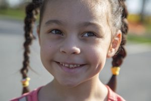
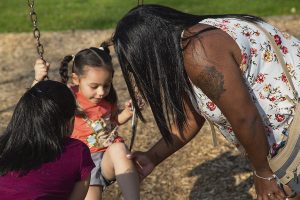
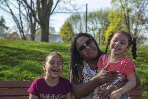
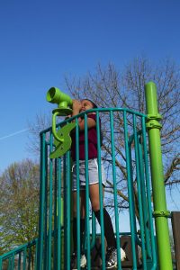
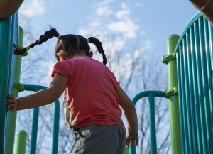
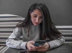
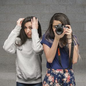
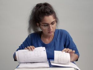
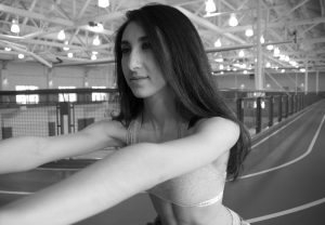
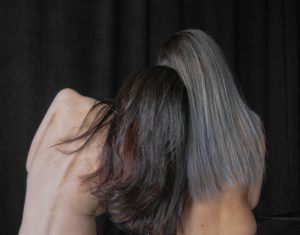
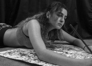
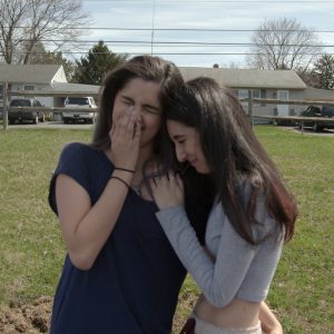
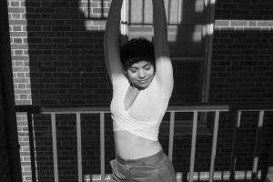
I decided to do my project on sisterhood. I chose this project for a few reasons. First, my sister means the world to me. I can say, without a doubt, that she is my very best friend. Because of that, I found it very easy to work with my sister. I am so comfortable around her, I had no problem keeping her for a long time and posing her. In capturing sisterhood, I attempted to embody how we can be very similar while doing completely different things, but at the end of
the day, we come together, depend on each other, laugh endlessly, and be our goofy selves.
Choosing my sister as a subject did not come without some complications. I initially had a lot of different ideas, but time and distance got in the way. My sister isn’t too far, but she isn’t next door. I worked to take good photographs, but also be efficient with time. We ran into some roadblocks, like the studio being taken for the day. Improvisation was present in a lot of the planning, but in the end it worked out (for the most part). I also had some trouble with large scale, but I was able to work around it.
RUNAWAY TEEN


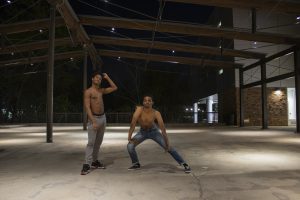
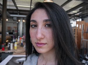
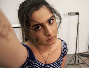
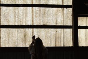
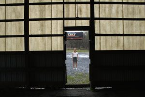
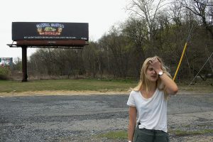
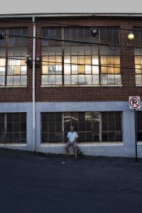
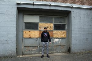
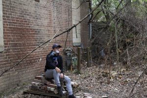
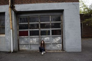
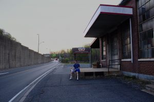
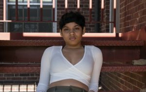
My project is entitled Runaway Teen. I choose this topic more out of necessity than choice. My original intention was to take very intimate photos in the studio however it was being used when I brought my first model down which led me to go outside and improvise. After some quick wandering, I found my mecca. An old abandoned tire factory or laundry mat (there are many rumors as to what it is) across the street from the William’s Arts Campus, a unique space covered in broken, paneled windows.
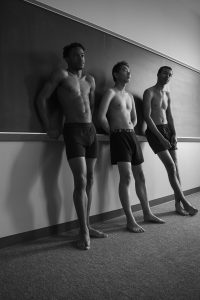
By placing my models all of which are students from Lafayette College, a fairly wealthy private institution, in this rundown setting I was able to play with the idea of not belonging. Their clothing signals to the viewer that they fairly well off but their setting signals the opposite. This juxtaposition allowed me to create a sense of loneliness and hardness in all of my photographs. It also allowed me to create a commentary on both fitting in and the fetishization of grunge and hobo-chic in our modern culture.


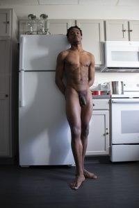
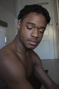
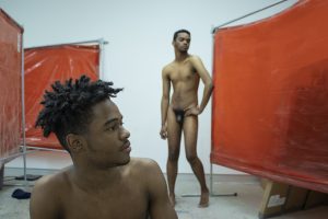
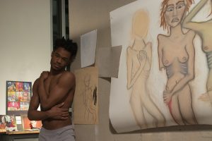
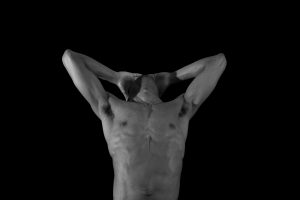
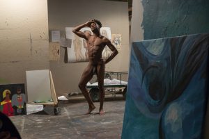
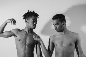
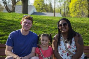
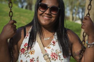
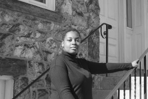
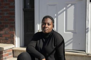
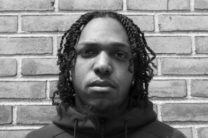
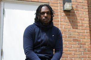
My project is titled “Personal.” This is because my images are all up-close and personal with the subjects. I chose this photography project because I wanted to bridge the gap between the photographer and the subjects; I wanted to illustrate that the shooter and the subjects weren’t strangers to each other.
I think that my project communicates the different characteristics of African Americans on a personal level. We get to see the bare human; the subjects just being themselves in their different environments. We also get to see how the idea of being black in America is really powerful through the use of photographs. Lastly, I believe that my project honors the intimate relationships that individuals can compose with places.
Since there are different people that photographed throughout my project, there were some complications. I initially wanted all 8 of my images to each be different people of color, but some people cancelled. Therefore, I had to work with the people who were then able to be photographed.
Found Geometries
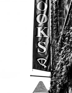
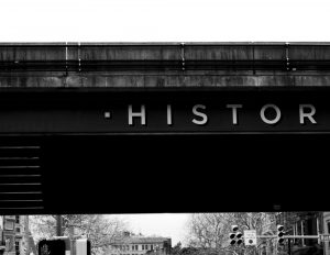
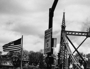
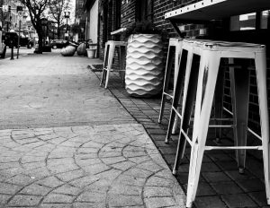
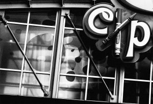
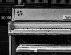
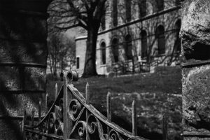
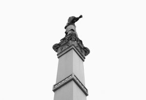
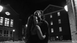
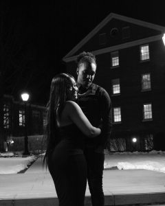
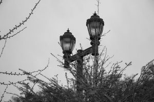
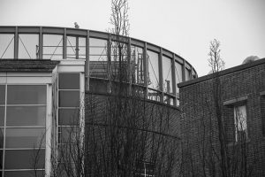
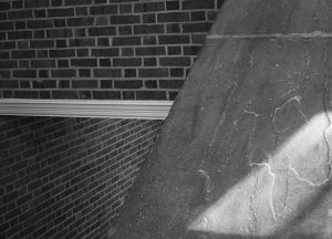
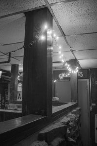
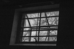
In researching Andreas Gursky’s work, I was fascinated by his abstraction of space into flat shapes of color. The monumentality that results from the careful composition (and pre-planning) of his photographs is what begun my exploration. I am fascinated by planes and geometry and how they are collapsed onto one plane in a photograph. Unlike Gursky, however, I was more focused on finding the geometry rather than pre-planning the shot. The photos in this project came about from walking and observing how individual geometries interact with each other. I paid particular attention to the interaction between architecture and other elements in space, highlighting the abstract shapes that emerge as a result of their interaction. In effect, these are all “found geometries.” The photos are in black and white as they are meant to emphasize composition and texture. In some cases, the blacks overtake most of the image but retain just enough detail to be able to make out what the subjects are. I am fascinated by this interaction of value and space, where seemingly mundane rectangles and planes converge and intersect each other to form a specific space. With that being said, there are a few shots that are a slightly too dark, but they still emphasize abstracted, found geometries.
![]()


![]()


in these/half truths – frankie illuzzi


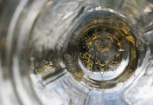
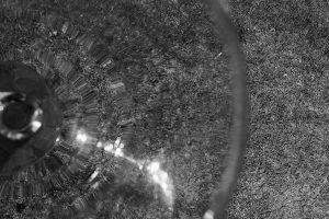
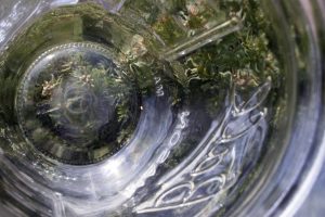
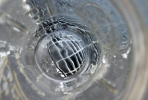
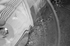
My project was heavily inspired by the work of David Seidner: I was also struck by what he thought about photography as a medium: “Little about photography is true of course, except that it serves up artifice and fantasy as truth. In these half-truths, we can only hope to ascertain glimpses of reality, reflections of a troubled or ideal world.” There is a fantasy in Seidner’s work that reflects beauty that can only be captured by photography. I tried to capture both the fractured feeling of Seidner’s glass distortion effects and the dreamlike quality of his overall work.
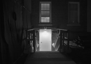
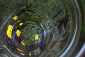
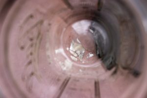
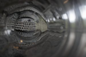
In my project, I used both a mason jar and a wine glass to achieve different distortion effects. The mason jar (used in all of the color photos), with all the ridges and lettering molded into it, produced a kaleidoscope effect that takes the subjects and shifts/bends them in a variety of different contours. The wine glass (used in the two black and white photos) allowed me to reproduce more concrete detail due to the consistent bend in the glass. I considered the glass to be an extension of the physical lens on the camera; a lens that helped me to produce photos that were simultaneously “wrong” because of the lack of focus and clarity, but interesting visually due to the shapes and colors created through refraction that aren’t visible to the naked eye. The glass both exposed and created perfect imperfections. Additionally, I made sure to incorporate both natural and manmade subjects. The natural subjects (flowers, grass, etc.) are in tribute to Seidner’s orchid images/the “real world” he believed his photography portrayed. The manmade subjects (concrete, metal grates, etc.) are meant to be both an extension of the physical, manmade apparatus used to capture the images and a break from that “real world” seen in Seidner’s images. I enjoyed playing with the duality of perception on multiple layers. This includes the use of two “lenses” (the actual lens and the glass) to produce a “glimpse of reality,” the duality of color and black and white, the duality of natural and manmade, and bringing all of these dualities together through a cohesive project. I feel as if the project loses something if not viewed together. The images play off of each other, reflecting their companions’ structure and shape, while providing alternate glances into a distorted world. I found that the greatest issue I had was displaying intentionality in my images; some of my images came out looking as if they were poorly taken, as opposed to intentionally distorted. I chose the images I felt best reflected intentionality in their creation.
