The problem we decided to focus on was that it took people way too long to find specific items in a grocery store. We came together and made a list of all of the people we thought could be involved in a problem like this and came up with many different groups. We wrote all of our ideas on post-it notes and organized them in a way we thought would be beneficial. From here, we were able to gather who was directly involved with this problem, the customers. After finding the group of people we wanted to help, we came up with ways to try and make their shopping experience better. We put all of these ideas together on post-it notes as well and put them together in groups.

Since we had found out who was involved with our problem and any future problems they could run into, we were able to make a small list of interview questions. We interviewed as many different people as possible. Some of us went to a grocery store itself and questioned people directly, while others called people they knew were regular grocery store shoppers. People in stores were very passionate about what could be fixed or changed in stores so we were able to gather much needed information concerning the problem. It also helped that we were in our group of interest so we had some thoughts and ideas that we could use in our final prototype. By interviewing a very diverse group of people, we were able to come up with a small list of the problems that people were experiencing.
For this specific type of display we decided to target an older demographic of shoppers. With this we assumed that some of the target demographic would lack certain technological skills such as a grasp of how to find and download a new app. We also were targeting users who may not be super familiar with a specific grocery store layout and or have trouble keeping up with changing layouts or things going out of stock. We decided to target this group, as many of the problems we were given felt like they had partial solutions in one way or another through purely digital means, yet many people we talked to mentioned that they still had these issues. Thus we wanted to provide a solution for people who don’t have the wealth of technological experience that someone who constantly uses their phone might have.
Some people were excluded in our design process, as our methodology of creating something that could be tailored to the changes of a store meant that many solutions with tactile feedback were less feasible. Thus, anyone with both audio and visual disabilities may find it difficult to use. We also relied on text to convey some of the information, and thus excluded any users lacking a certain level of literacy. Additionally, we accepted that the use of text would likely exclude anyone whose primary language is not provided as a language option. We attempted to be accommodating to wheelchair users while not forcing taller users to hunch over by using a large screen where the menu centers on the area where the user taps, but the solution still requires the physical ability to touch buttons on a screen for use.
Our final solution is pretty much a kiosk that helps list, find, guide, and print out all the items that people are looking for before they start shopping. Note that this is not the final decision people make but just a quick glance at where all the items are located within the grocery store to help them have a better shopping experience (since most people are pursuing efficiency and don’t like the feeling of getting lost within the store). This “kiosk” looks like a large, standing screen at the entrance of the store, with a printing outlet attached below. The outlet will provide a sheet of items wanted, which are numbered for marking on map, with a map on its back, showing the locations of each wanted item by marking with numbers (referring to the item number).
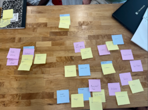
The building of the solution stems from narrowing down different assumptions we came up with. To the problem of finding things quicker in the grocery store with marked prices and aisles. For the solution we have used the pugh chart method in the beginning to identify the problem in the grocery store. This method wired the connection between customers’ needs and how we can build solutions to the problems.
First, we have used the resources like a pugh chart where we have discussed who is there in the grocery stores and where do groceries come from. This helps build concrete needs for customers and we came up with a kind of display screen at the entrance of the grocery store. We make good changes like first we came up with a robot idea, then to the display screen with a map of the grocery store.
This gives simplified space where customers can create the list with marked price and aisle, making shopping easier and quicker.
After we came up with a solution, it was time to test the solution. For this we prototyped it through a paper presentation to figure out what’s wrong or what we can do better. In the process we came across two search buttons on the home screen which let access the customers create listing the list of items and where they can find them. We upgraded the paper prototype in the second test. We had modified it with one search button at the home button. This is how we dissolve the solution.

After testing the prototype 1 and 2 with classmates, we collected both feedback from them and through observation; this feedback reflects if our idea reaches our goal successfully or not, and also gives a response if anything that we never considered before.
Practice is the only criterion for testing truth.
We have tested both the first and second prototype with three trials each. Though both went smoothly, we find it repetitive and unpleasant to separate having a list telling which aisle is located in words apart from the visual map showing the location. It literally makes one do twice the work to get results they want. And thus, in the second prototype we simply combined these two similar functions together and attached a map on the back of the prints so as to save paper and make people’s lives easier. After that small change, the whole process became clearer and more convenient, the first time user then had little problem accessing our design when completing the goals we set previously for testing.
Right away, we found multiple problems that we wanted to solve and already had basic solutions to those problems so it was really easy to pick out good ideas and discard bad ones. One of the hardest parts in the design process is starting it and making sure you have a solid problem to solve and a good solution to that problem, and after that, refining the solution is easy.
One of the main challenges we faced was coming up with one solution and one design to focus on and making sure all team members were all on the same page. In the end, we managed to merge together three separate ideas into one practical solution, but it took some time to combine them in a way that worked. Another challenge was designing our prototype so that it could be accessible by almost all types of people and didn’t exclude anyone, which changed our design multiple times. Another challenge was making sure our design was practical and could be useful in real life applications and didn’t copy something that already existed.
If we had redone the whole assignment, we would have focused more on finding the problem first and then working on the solution second. We had a habit of jumping to conclusions before we fully understood the problem itself.