The Team
Sophia Gaysinskiy– Sophia is from Chatham, New Jersey and is a freshman at Lafayette College. She plans to major in bioengineering and is on the premed track.
Lorelei Folger– Lorelei is from Shirley, Massachusetts and is a freshman at Lafayette College. Her plan is to major in engineering.
Ray Kerrison– Ray is from Vernon, New Jersey and is a freshman at Lafayette College. He plans to major in mechanical engineering.
Sam Carter– Sam is from Easton Pennsylvania and is currently a freshman at Lafayette College. He currently aims to be a mechanical engineer.
Jack Newberry– Jack is from West Hartford, Connecticut and is a freshman at Lafayette College. He plans on majoring in engineering.
The Problem
Everyone knows that it takes to shop, from locating items within a store, to waiting in extremely long lines, and checking out in a reasonable time. This is especially problematic for customers who work long hours and have a plethora of responsibilities within their everyday lives. Therefore, our team’s goal was to redesign the grocery store experience to be faster and more efficient for busy customers.
We identified this problem by taking a trip to the local Giant store to observe and conduct short interviews with customers. We asked customers four simple yet open-ended questions including “do you commonly visit this store?”, “what do you like about this store?”, “what do you find most inconvenient about going to the store?”, and “is there anything you would like to see redesigned?”. We observed customers wandering around searching for a product they could not seem to find, as well as a lack of signage in the main aisles that cut horizontally across the store. We received common responses in the interviews including congestion in the store due to long lines at checkout and an inability to find items due to the reorganization of the store. These common answers led us to our problem we aimed to solve – shortening checkout lines and making it easier to find things in the store.
Our Persona
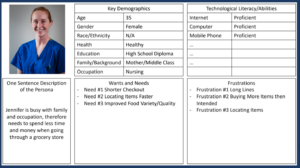
Our target user is a middle-aged mother with a time consuming career. Our persona is too busy for a long shopping experience, so she is searching for a more efficient way. Her complaints about the current grocery store experience are that the lines are too long, she ends up buying more items than intended, and has trouble locating items. This allowed us to formulate our functional requirements to help this persona. Of course, our goal is to make this app accessible to as many people as we possibly can. However, our app does require the user to be technologically proficient.
We recognize that our solution does not help people knowledgeable of the store layout, people who are not proficient in using technology, people who don’t have access to a smartphone, and people who order their groceries online. Though our goal was to cut down the checkout lines, we decided to leave that option open to provide for the less technologically proficient customers.
Our Path to the Solution
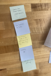
In order to come up with a solution, we used the gallery method. We sat quietly and wrote our ideas on sticky notes and put them in the middle of the table. We were all able to come up with ideas based on our group members’ sticky notes. After five minutes of brainstorming, we ranked our solutions and came up with a top five.
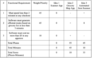
We then created a chart where we listed our functional requirements and gave our top three solutions a score based on how well they fulfilled each of the requirements. In the end, we decided to combine two of our ideas to create our solution – a map and scanning app.
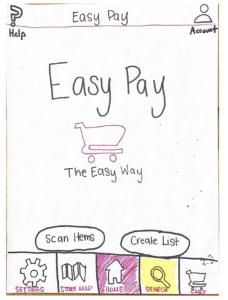
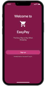
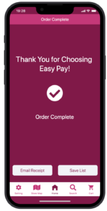
Our final solution, EasyPay, focused on shortening checkout lines and making it easier to locate items – both combined would reduce the time spent in the store.
The Prototypes
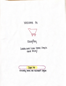
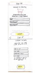
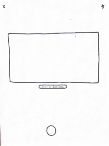
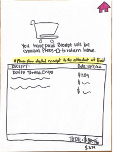
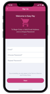
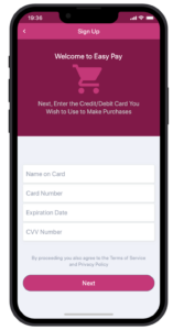
We started out by making a paper prototype of our app which rotated through screens as “buttons were clicked” to simulate the use of the app on a smartphone. Our classmates then tested our prototype by completing the task of buying doritos and we noticed that they had trouble completing this task. Testing allowed us to find the flaws in our design and make changes and improvements which included adding a “find in store” button on page 5 and a “scan item” button on the map page. These additions were made to make the goal more clear for the user. We also added an anti-stealing measure by having an attendant stand at the exit of the store to check the receipt and the cart. After we were happy with the prototype, we made the final digital version using proto.io.
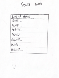
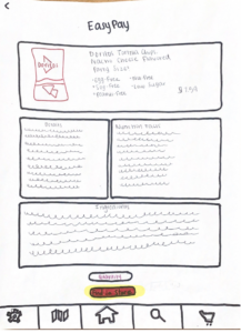
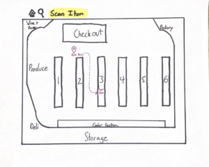
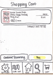
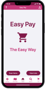
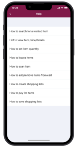
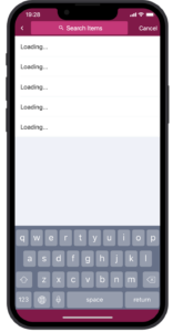
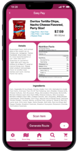
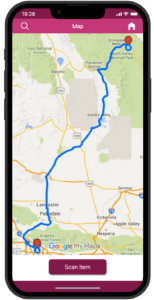
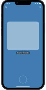
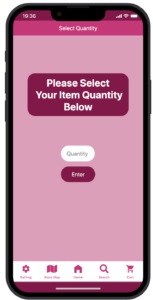
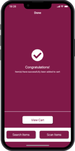
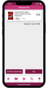
The features of our final prototype include the scanning and map feature. Customers are able to preprogram a shopping list, which can also be lists of previous purchases, and the app will create a route on the map which brings the customer to all their items in the most efficient path. When the customer gets to each item, they can scan the item on their phone and at the end, they simply press pay and the app automatically checks them out. Alternatively, customers may opt to search for items one-by-one. Once they search the item, an information page will pop up and they can tap the “find on map” button which will show them where in the store their item is and the fastest way to get there. After they have paid, they will need to show an attendant their receipt in order to make sure nothing was stolen. Through these two main features, customers avoid spending a long time in a checkout line and wasting time roaming around the store looking for a specific item.
The Future of EasyPay
It’s important that our solution intentionally includes all types of people with various abilities and disabilities so in the future we would create more features that make the app more accessible (ex. audio cues). We would also like to add an option to scan and add items to the shopping list from other areas of the store including the deli and bakery.
The Design Process
Our team did a good job creating a design for the prototype. We were all able to come up with problems with the current grocery store experience and then easily combine our ideas which allowed us to reach a final idea that we all agreed on. We were also able to work well together throughout the entire design process.
A challenge our group faced throughout the design process was creating a clear prototype that accomplished a specific goal and task. When other groups first came to test our prototype, we did not have a specific set of tasks laid out, so we were not sure what order of papers to put down when they “pressed a button”. We then narrowed down the specific goal we wanted them to reach which yielded more specific feedback and helped us improve our prototype.
If we had the chance to redo this project, the biggest changes we’d make would be being more proactive when it comes to testing our prototype as well as coming up with a clear goal/task for users to complete prior to making the prototype. Testing our prototype more frequently would help us catch things that made our app harder to use. It is possible that because we designed the app, it made sense to us but was more difficult for testers to use. Narrowing down our goal sooner would’ve also helped us focus on creating a clear path for our prototype rather than adding too many features that over complicated the process.