THE TEAM:
Jay Ascher – Presentation God – Youtube Star
Henry Epstein – Biker Boi – Designs the crap out of some software
Quentin Humphrey – Prototyping Extraordinaire
Emil Arangala – Website Wizard
Tomas Verbinski – Team Leader – Baller
THE PROBLEM:
We chose to address the issue concerning peoples ability to retrieve items off high shelves. There are many walks of people that may have trouble accessing these items without help from someone else.
These people include:
- Vertically Challenged
- Elderly
- Disabled
- Young Shopper
We noticed that in our observations of the local grocery store, there are many shoppers who do not have the ability to be independent in their shopping experience. Whether that be because they needed to get assistance from an employee, or if they need to bring along a more able bodied companion, there is a large pool of people that do not have independence in their grocery store visits.
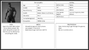
THE AUDIENCE:
In order to personify who we are trying to help we created some characters that fit the description of our target audience.
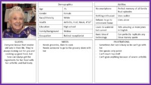
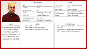
In addition to creating personas of our target audience we created one for the opposite of out target audience. This is who we aren’t trying to help with this design, because they already have a pretty easy grocery shopping experience.
THE POSSIBILITIES
Once we decided who we were designing for and what their needs are we began brainstorming solutions that would satisfy those needs. We laid out our ideas on a chart to visualize the difficulty of the solution for both the store and the customers.
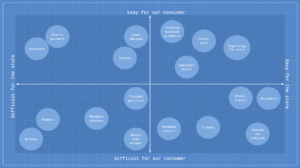
We then decided to focus on the solutions that were easy for both the costumer and the store (top right quadrant).
These solutions are:
-
Insta-Cart
-
Conveyor Belt
-
Vending Machine Grabbers
-
Digitizing Store
With our choices slimmed we looked at the pros and cons of our solution selection
Insta-cart
- pros
- very streamlined
- cons
- still not providing independency
Conveyor belt
- pros
- pretty easy to use after a while
- cons
- confusing design at first
- a lot of changes to the grocery store experience
Vending machine
- pros
- simple
- allows average shopper to shop the way they did before
- independency
- cons
- still slightly inconvenient for people not in our target audience
Digitizing store
- pros
- extremely streamlined
- cons
- loss of all interaction
After looking at the pros and cons we decided that the vending machine solution would likely be the best one to choose.
THE PROTOTYPES
Throughout our design we came up with multiple prototypes not just for the vending machine grabber itself but the shelf system as a whole, and the interface that would be used to operate the vending machine.
We started out by making some physical prototypes of both our box and our shelf.
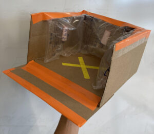
Box Features:
-
Wedge to pick up items
-
Padded sides as to not break items
-
X on floor of box indicates a grippier surface
-
3 closed sides so items do not fall out
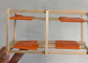
Shelf Features:
-
Open so customers not using machine can still shop normally
-
Sliding mechanism that box is attached to in order to retrieve items
After we created physical prototypes we moved on to making more accurate digital prototypes. For these designs we focused on the box itself, and the software interface that the costumers would be interacting with.
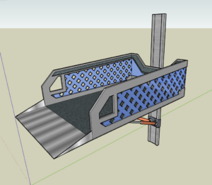
Box Features:
- Padding along siding and bottom
- wedge to pick up items
- lightweight design to save materials
- grippy bottom so items don’t slip
- hydraulic support rods (orange cylinders towards bottom of design)
Unfortunately the interface walkthrough wouldn’t upload properly so if you would like to view the video walkthrough please CLICK HERE to download the video.
Interface Features:
-
Ability to add and remove items to cart
-
the machine will pick up items in cart after checkup
-
-
Multilingual so non fluent English speakers can access it
-
Touch screen allows for easy use
WILL IT WORK
Of course no matter how much we like our design and think it will work, that doesn’t really matter if no one can use it. So we did some testing. We had some higher level students test out our user interface and they found it quite easy to use, they did hope for us to add some features that would be pretty simple fixes in the real world but not plausible with the interface designer we were using. As for the box it seems to also work quite well. Using a rolling chair, a shelf, an apple, and the team we tested how well our mechanism could actually pick things up. We had someone sit in the chair holding the box go and retrieve the apple that we placed on the shelf, and it did its job quite well.
IMPROVEMENTS
Just like everything else in the engineering world there are always improvements to be made. Here are some improvements that we would have hoped to add to our design if we had more time.
Sirens – Much like other heavy machinery in warehouses and stores we want people to know when it is nearby so adding a subtle horn system and blinking lights would go a long way in keeping people safe.
Motion Sensors – We would like a final product of this design to have motion sensing features so that it can stop before it hits anyone along the shelf line. This also increases the safety of our design.
Item Recognition – Not everyone is perfect, some people put items back where they aren’t supposed to be. Adding item recognition to our box would help it determine whether or not it actually picked up the item the shopper wanted.
GROUP SETTING
The best thing we did as a group was our division of the workload. We all made sure to do what we could where we could. Quentin tackled working on the physical prototype. Henry worked on making a usable interface. Emil worked on the digital prototype and the website. Jay worked on the presentation. And Tomas directed everyone and lead the group in the right direction with valuable input.
Some challenges we faced along the way was conflicting schedules.