The Team
Welcome to our page! Let us introduce ourselves.
| Grace Tulevech |
Emily Mastroly |
Edgar VanEysden |
Anyu Huang |
Jackson Griebel |
|
Hi! My name is Grace Tulevech. I am a senior Biology, B.S. major from Morehead City, NC. |
Hi! My name is Emily Mastroly, and I’m a freshman planning to double major in Engineering Studies and Environmental Studies. I’m from Downingtown, PA. |
My name is Edgar, I am from New York City and I am a freshman mechanical engineer. |
Hello, my name is Anyu! I am a freshman computer science major from China! |
My name is Jackson and I am an Economics major from New York City! |
 |
 |
 |
 |
The Problem
We all know that grocery shopping can be a hassle, no matter who you are; however, the process certainly becomes more challenging for those with mobility issues. Our group chose to tackle some of the issues older populations frequently face during their grocery store experience.
Our team took to interviewing 10 people over the age of 60. We developed a set of 10 questions to ask each user in order to identify any common issues among that demographic. Each of us found that, surprisingly, there was a common theme. Many of our users reported that they struggle to put heavy cases of water into their carts and to then transport them into their cars.
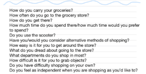
List of questions asked to each interviewee
Even as young college students, we agreed that even we struggle with the same thing from time to time – imagine how challenging it can be for your grandparent!
Our Design Persona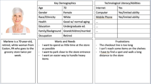
Marlene is a persona who generally describes what kind of person we think we would be designing for, and the wants/needs/frustrations that person may feel while grocery shopping.
Our solution is inclusive of many groups as it is simple to use and requires no physical ability whatsoever. We intentionally included a language selection to make our solution more accessible for those who don’t speak English. We also made sure the screen is large and simple enough for elderly people with vision problems.
We came up with a list of functional requirements that we wanted to ensure our product met, including:
- Our product should be easy to move
- Our product should be easy to access
- Our product should be easy to use independently
It was important to us as a group that someone with limited technological ability and physical ability would be able to use our design easily.
Our Solution
Over the course of a few weeks, our team developed a solution that would solve the problem of heavy water case transportation. While primarily aimed towards older populations, our solution can be used by anyone.
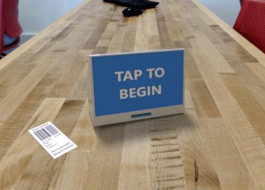
In short, we developed a ticket-printing computer that could be attached to shelves near the cases of water in grocery stores. It is comprised of an 11 inch screen and case that dispenses a ticket to the user that can be carried to checkout in place of a case of water. This system eliminates the hassle, and sometimes impossible, task of lugging a case of water off the shelf and into your cart.
The process is simple – tap the screen to begin, select a brand of water, size, and quantity, and select “Finished”. A ticket with a barcode is printed and dispensed that can be brought to checkout and scanned by a cashier. Someone from the grocery store will retrieve your product and place it in your cart or carry it to your car.
No more struggling with heavy cases of water!
Our Design Method – Design Selection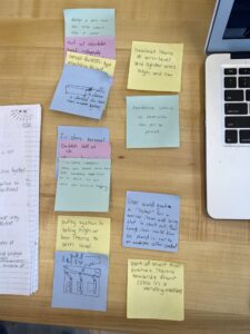
To come up with a solution, our group utilized what is known as the gallery method; we sat in silence, writing ideas on sticky notes and using each other’s ideas to generate solutions. We then laid out all of our sticky notes and ranked our solutions based on their uniqueness, individual interest, and general worth/impact. Once we had narrowed our list down to approximately 5 worthwhile solutions, we used a Pugh Chart to evaluate them.
A Pugh Chart works by assessing our solutions against a general baseline and assigning them a score (positive or negative). The higher the score, the better the solution. Our rough idea for a ticket-printing system tied for the highest score in comparison to one other potential solution. We decided as a group that the ticket-printing idea was more practical than the solution it tied with, so we chose to develop it further, eventually leading us to our final design.
Our Design Method – Building a Prototype
Once we had solidified an idea, we began to build our first prototype. We divided our team into two groups – half of us would build the physical model of the case, and half would work on the design and functionality of the screen.
In order to build the physical case, we assembled a box out of cardboard and cut a slit in the front to represent the ticket dispenser. As a very rough design, it was intended to simply represent the size and dimensions of our idea and it ended up being quite clunky, large, and awkward. For the building of the second prototype, we cut down on the size and make the design more sleek and functional. We also made the screen larger and easier to use to better meet the needs of our demographic.
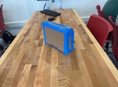
Revised prototype for the ticket dispenser case.
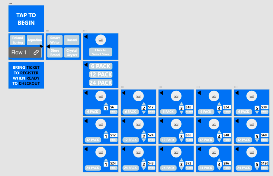
In terms of the software and display screen, we first sketched out what we wanted the user interface to look like, including different buttons and the order in which each screen would appear. We then made a functional model of the user interface in Adobe XD that could be interacted with the way a customer would use it in a store. The final prototype consisted of large, easy-to-read buttons and simple steps that could be easily navigated.
In the image to the left, each blue square represents a screen that the user may interact with. The design was intended to be simple and easy to read and self-explanatory. The final screen reads “bring ticket to register when ready to checkout” in order to provide the customer with directions detailing what to do with the ticket that was just presented for them.
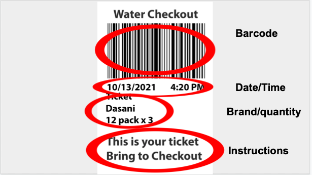
In terms of the physical ticket that is printed for the user, we wanted to give some direction as to what to do with it, purposefully including instruction at the bottom that would inform them what to do with it should they forget. Also included in the ticket is a barcode to be scanned at checkout, the date and time the ticket was printed, and the items the user selected.
Prototypes and Testing
We created and iterated a series of prototypes in order to visualize and physically test our solution. Throughout this process, we had other students with little knowledge of our project try out our prototypes. We observed and evaluated the levels of ease and comfort they had while using our prototypes, utilizing this information to tweak aspects of our solution. We know that our current solution works because it is user-friendly and accomplishes our intended goal of helping people who cannot carry a case of bottled water.
We also evaluated our solution against the functional requirements that we set at the beginning of the design process. These included users having to exert no more than ten pounds of force, users not having to reach above five feet or below two feet, and each screen having as few buttons as possible. Our final solution met all of these requirements, proving that it can effectively be used by our target audience to perform the intended task.
3D model of finalized prototype including ticket that a user would receive.
The Design Process
What went well?
Our team worked well together and generated a solution that everyone is proud of. Since we all possess varying degrees of experience with engineering and design, we were able to contribute different perspectives. This also helped us to efficiently split up our tasks.
We began the design process by choosing a specific population to focus on. For our main brainstorming technique, we wrote ideas down on sticky notes and spread them out for the whole team to see, then grouped them together and ranked them. This brainstorming method was very useful to us throughout the design process as it helped us to visualize where we were in agreement and to become inspired by others’ ideas.
We collaborated and utilized effective communication skills as we built and altered our prototypes. Since everyone had different skills to bring to the table, the process of creating the physical and digital prototypes went very smoothly. We were excited by each other’s contributions and enjoyed watching the direction that our project took.
Some challenges we faced?
While our team worked fairly well together, we were not able to avoid challenges during the design process. The main obstacle we faced was limitations with our prototype. We could only achieve low and medium fidelity prototypes with the resources and time available to us. Additionally, our overall design involves human components (grocery store workers retrieving the cases of water for customers), but we were not able to test them.
As a team, we had a more difficult time agreeing during the beginning of our project. However, as we collaborated and spent more time together, we developed a successful system of communicating and making decisions. By the end of the design process, we were all satisfied with our work from the past few weeks.
What would we change?
If our team was to redo this design, there are a few changes that we would make. Most notably, our target users are people over the age of 60, but due to time and resources constraints, we were unable to have anyone from this population actually try our prototype. In the future, we would make sure to have our target users test out our prototype, ideally in the context in which they would use it (i.e. in the water section of a grocery store). We would also like to spend more time conducting interviews and gathering user experiences. At the beginning of the design process, our team interviewed people over the age of 60 who were most accessible to them. If we were to redo this design process, we would take more time during the interview stage and talk to a larger group of people.